Crafting an Inclusive Digital Experience

Access Now

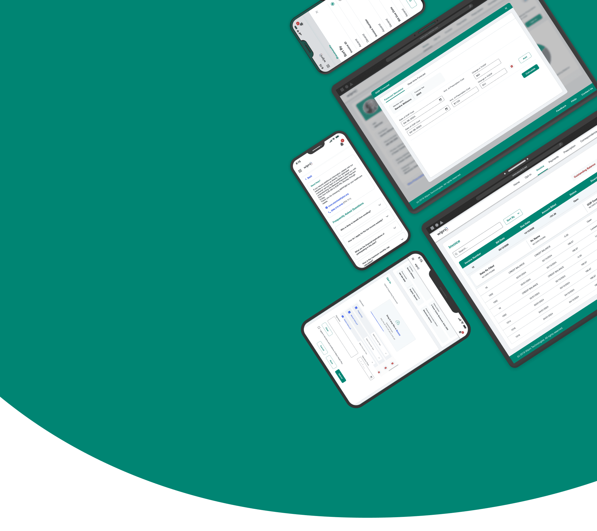
Revamping a medical product for the US market to ensure ADA compliance and drive wider adoption.

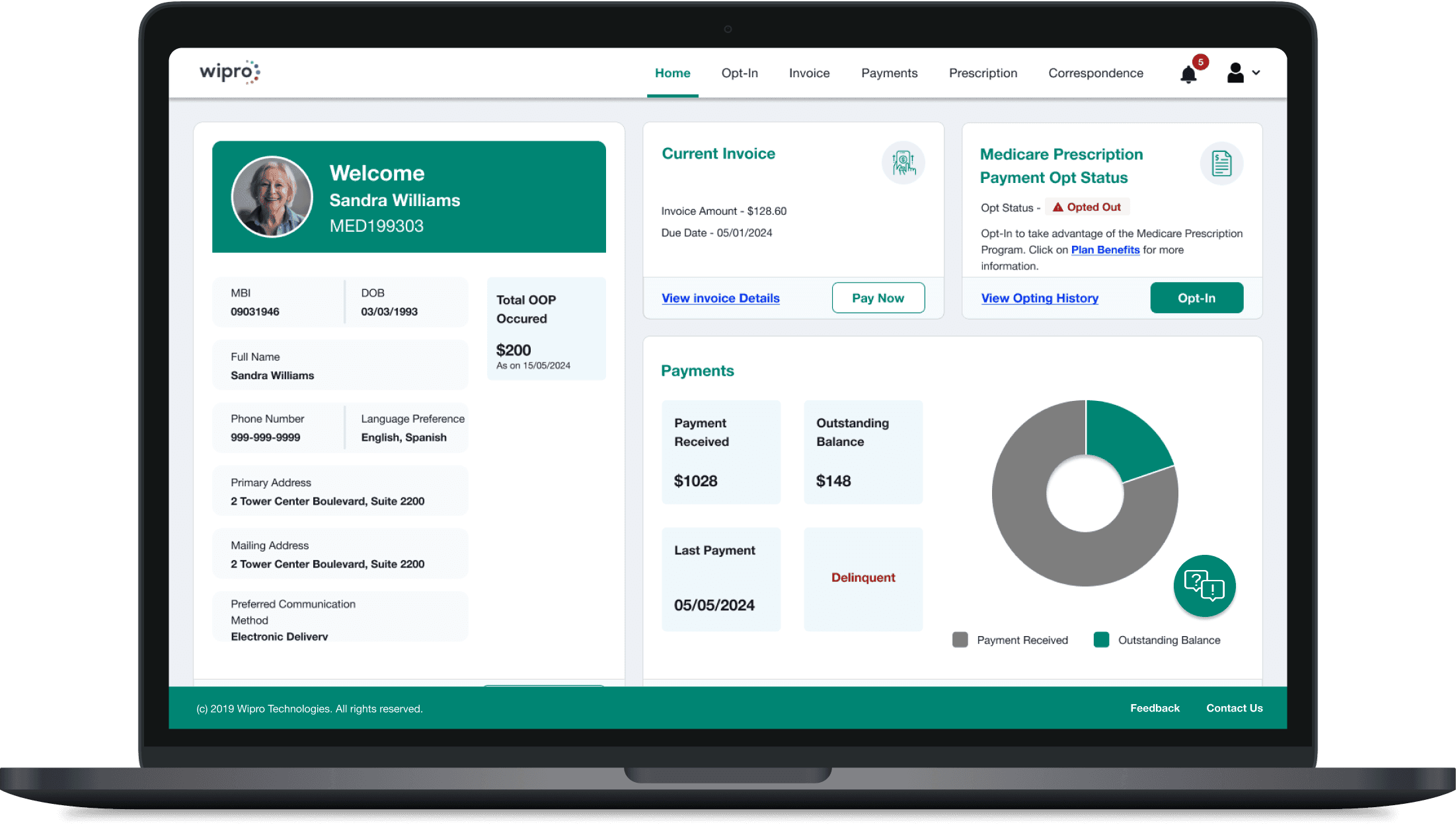
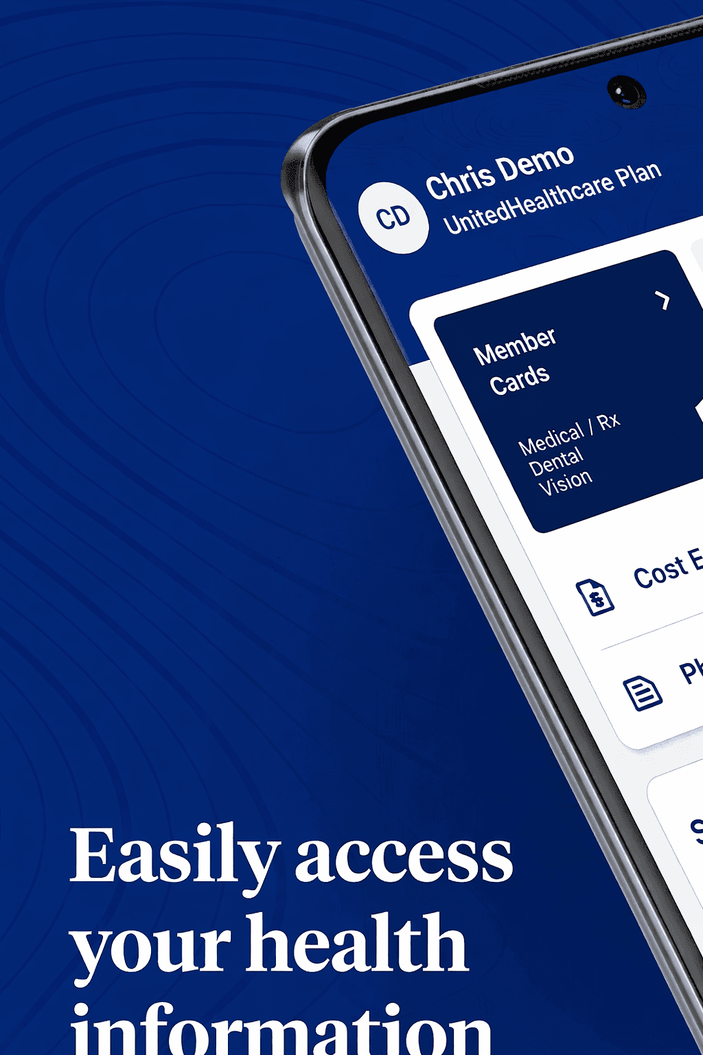
My client, who offers a Medicare product suite for the U.S. market, was facing challenges because their offerings were not ADA-compliant. As the UX Lead on this project, I led the redesign of their flagship medical product and conducted UAT with real users of assistive technologies who have visual disabilities.

Revamping a medical product for the US market to ensure ADA compliance and drive wider adoption.

My client, who offers a Medicare product suite for the U.S. market, was facing challenges because their offerings X not ADA-compliant. As the UX Lead on this project, I led the redesign of their flagship medical product and conducted UAT with real users of assistive technologies who have visual disabilities.

Client

Wipro (Internal Product)

Duration

6 months

Industry

Healthcare Insurance

Scope of Work

Accessibility Design

Design System

User Acceptance Testing
Balancing Inclusive Design and Visual Appeal.

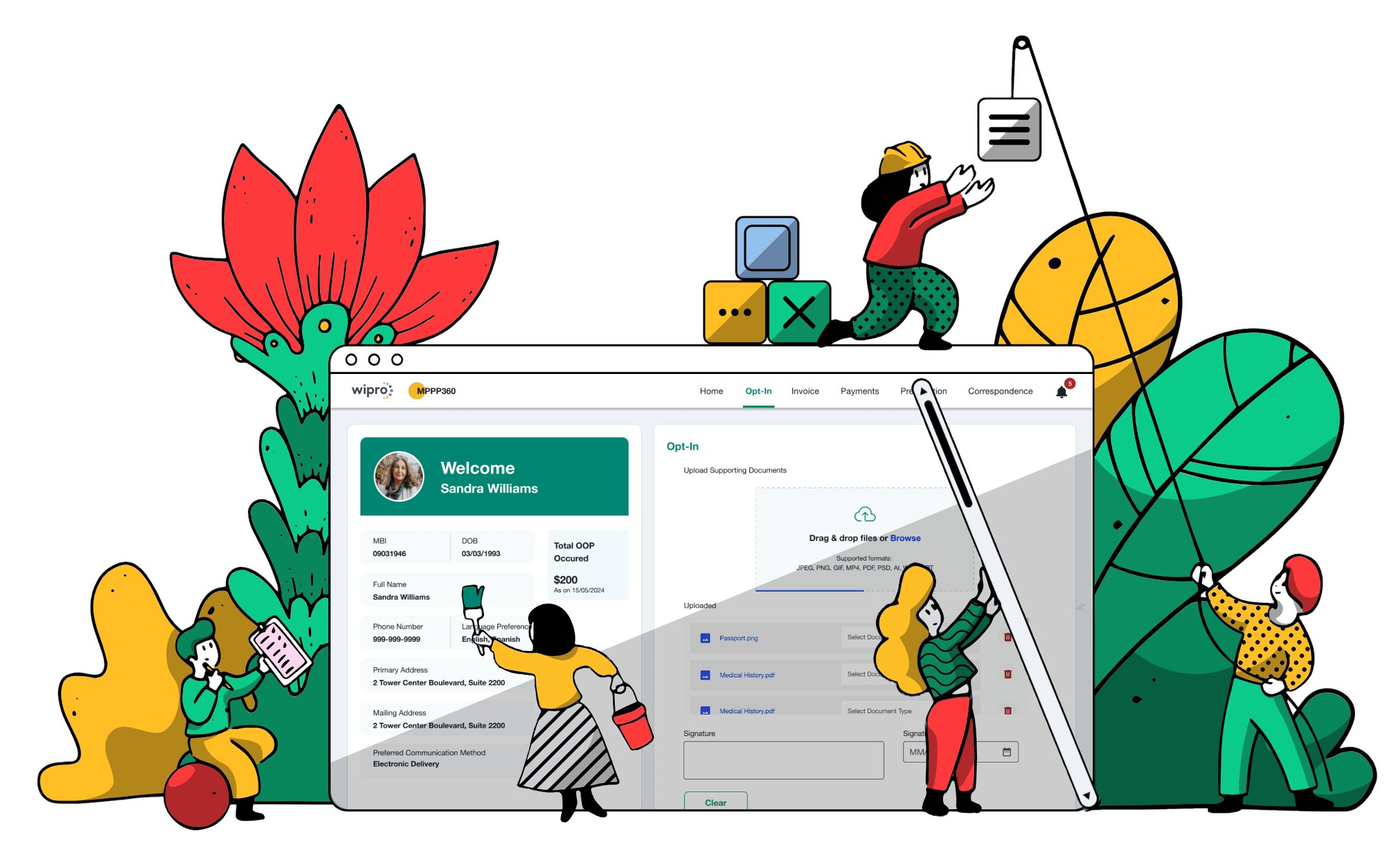
This medical product was intended for widespread use by individuals with disabilities. In every decision, function led form. I prioritized usability and ADA compliance over aesthetics, ensuring it worked seamlessly with assistive technologies.

MY APPROACH TO INCLUSIVE DESIGN

Started with a UX audit to uncover critical UI and accessibility issues, setting the foundation for a full product revamp. As the scope grew, I scaled the team to three designers and led the end-to-end redesign.

UX Audit & Usability Review

Audited the legacy app using NN/g principles. Identified key issues and defined actionable improvements.

Stakeholder Alignment

Audited the legacy app using NN/g principles. Identified key issues and defined actionable improvements.

Accessible Design System

Created an accessibility-first design system for consistent, scalable, cross-device experiences.

User Acceptance Testing

Tested with assistive technology users to validate accessibility in real-world use.

UX Audit & Usability Review

Audited the legacy app using NN/g principles. Identified key issues and defined actionable improvements.

Stakeholder Alignment

Aligned stakeholders on priorities, shifting the scope from incremental fixes to a full redesign.

Accessible Design System

Created an accessibility-first design system for consistent, scalable, cross-device experiences.

User Acceptance Testing

Tested with assistive technology users to validate accessibility in real-world use.

MY APPROACH TO INCLUSIVE DESIGN

Started with a UX audit to uncover critical UI and accessibility issues, setting the foundation for a full product revamp. As the scope grew, I scaled the team to three designers and led the end-to-end redesign.

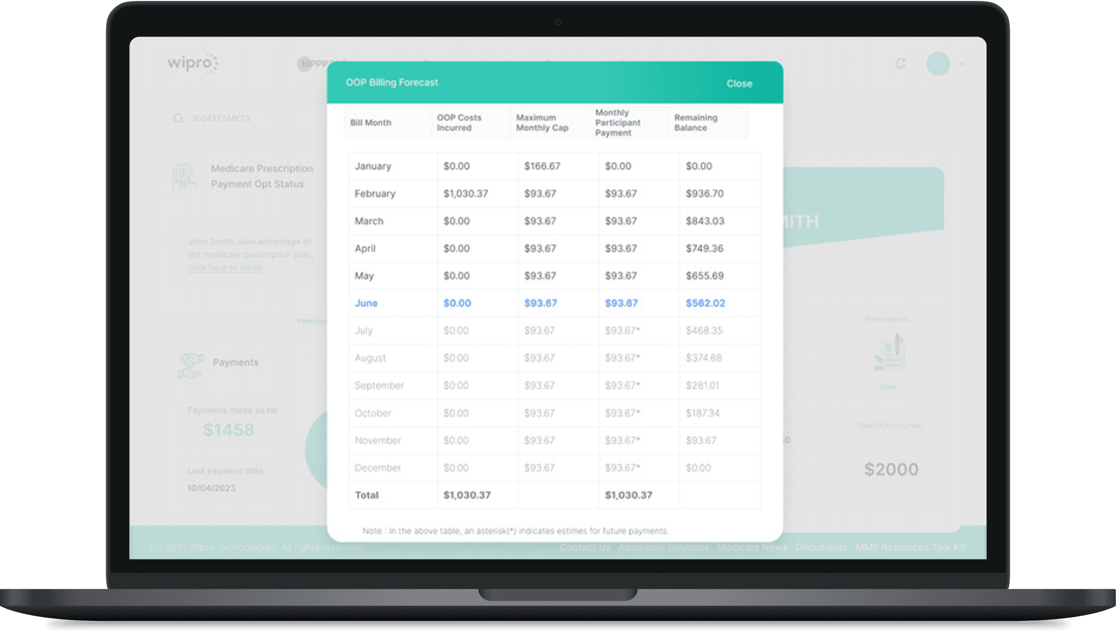
01 · MAKING COLOR ACCESSIBLE AND READABLE

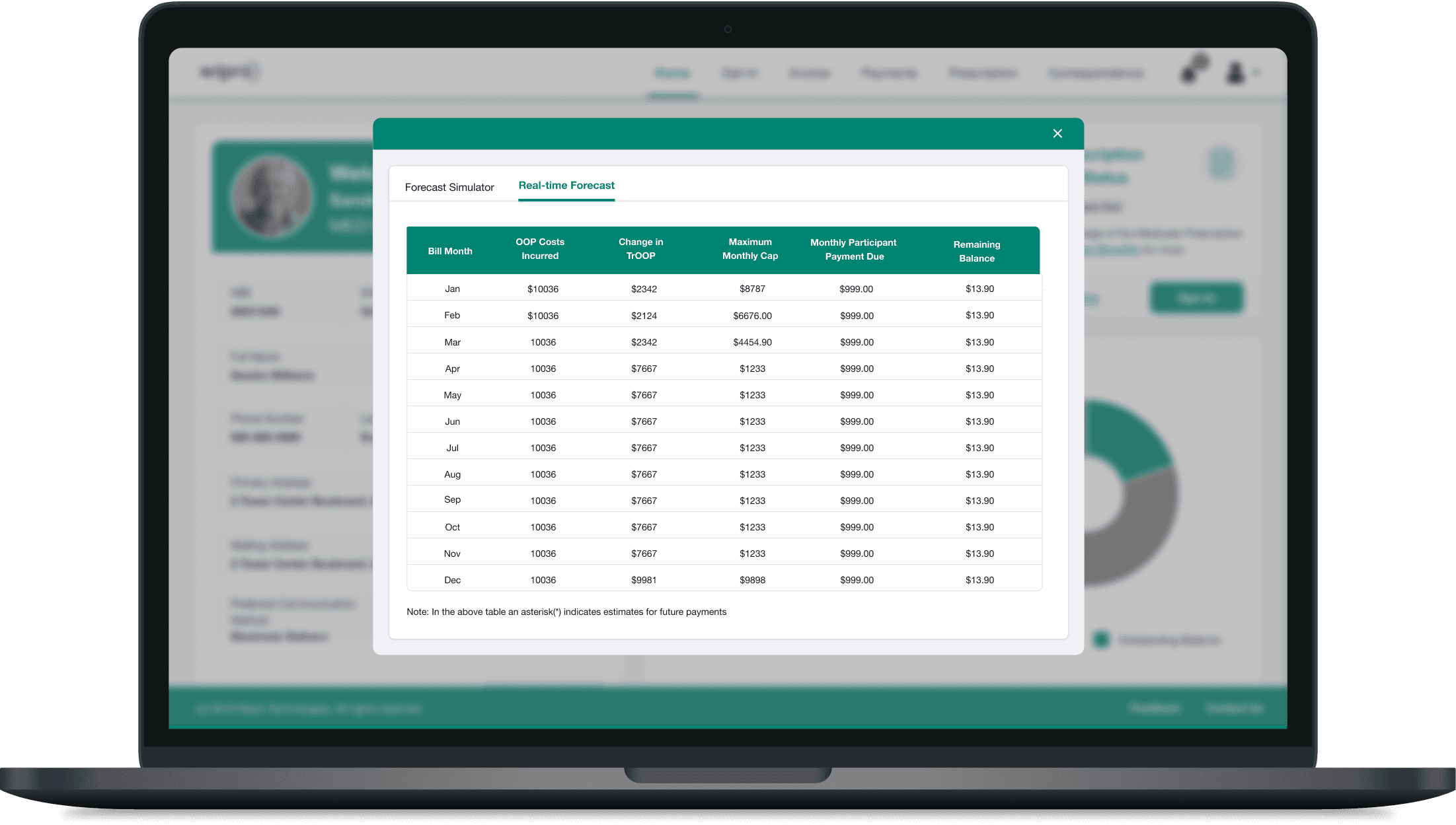
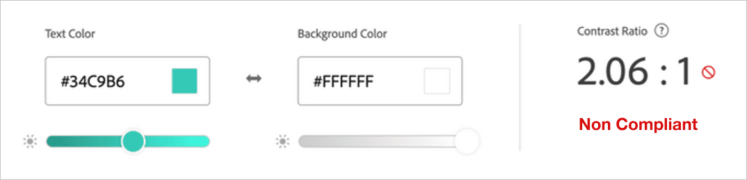
Through direct interaction with users who rely on high-contrast settings, I gained valuable insight into their visual needs. These learnings informed the selection of color combinations that meet WCAG standards, significantly improving readability, clarity, and overall usability across the product.
Before
After

Before

Before
Before

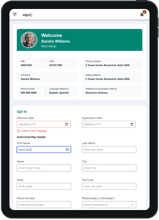
02 · Optimizing UI for Assistive Tech

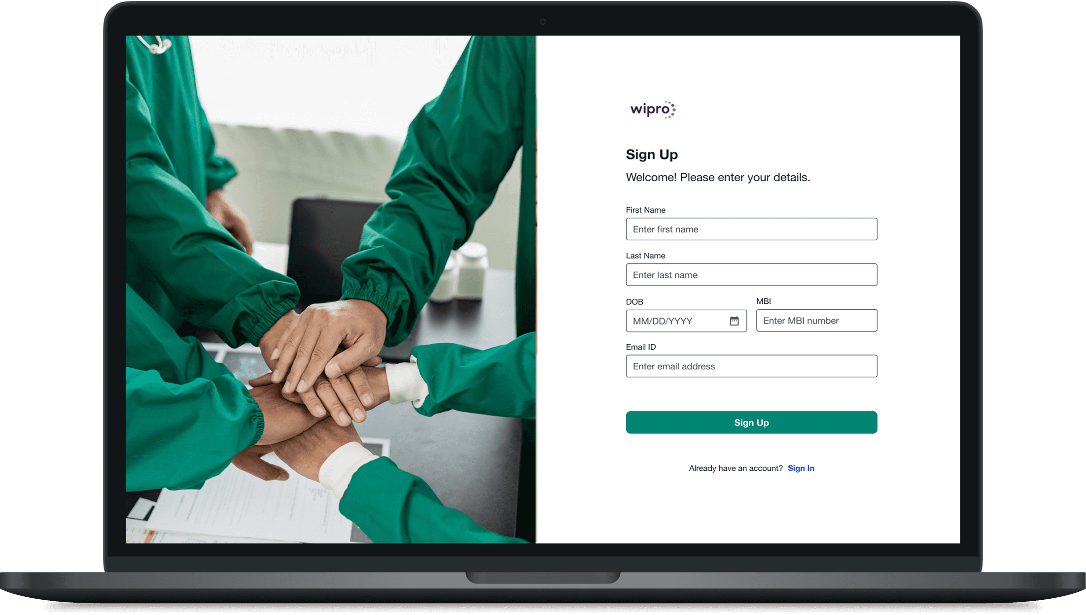
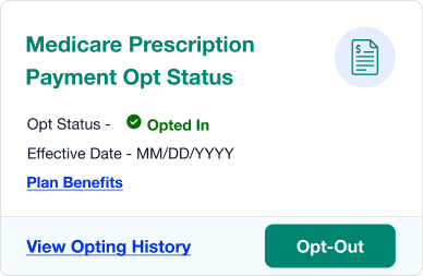
We established descriptive placeholders, persistent labels, and clear error/success indicators. ARIA labels were defined for all interactive elements, ensuring screen reader clarity. These enhancements were embedded into the design system, making accessibility the default standard.
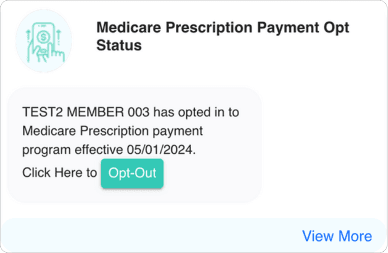
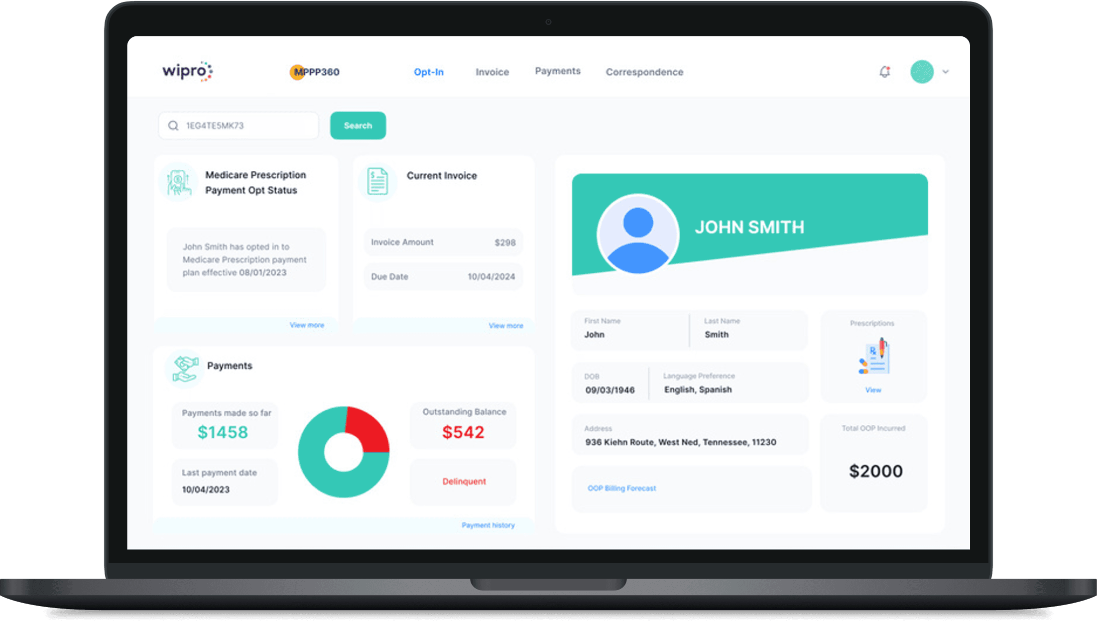
03 · STRUCTURING VISUAL HIERARCHY USING GUTENBERG PRINCIPLES

Applied Gutenberg’s diagram to establish a clear visual flow and guide user attention toward key actions. By strategically repositioning content and CTAs along natural reading paths, the interface became more intuitive, improving scanability and engagement.
Before
After

04 · DESIGNING RESPONSIVE EXPERIENCES ACROSS BREAKPOINTS

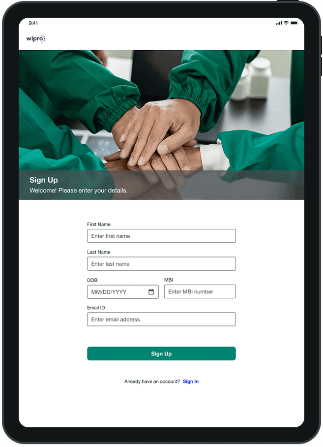
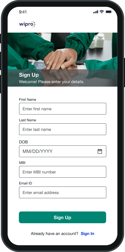
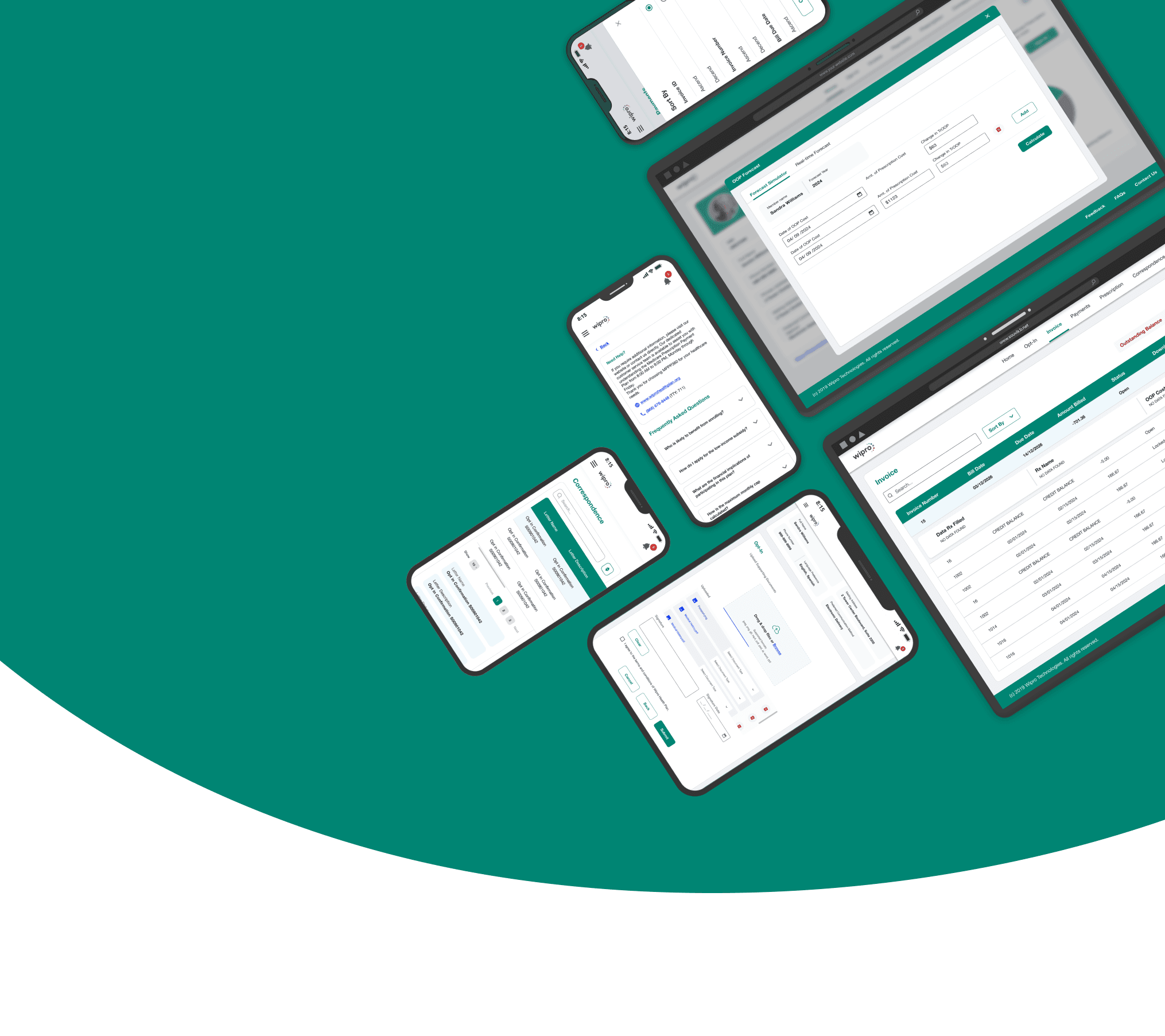
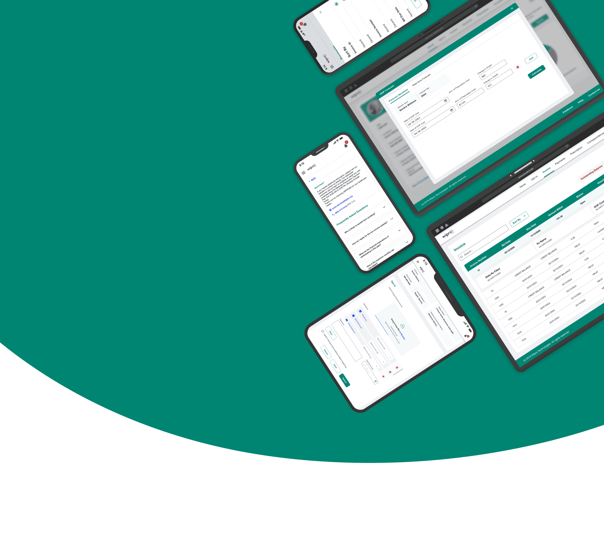
Developed responsive prototypes using defined breakpoints for mobile, tablet, and desktop. Leveraged auto layout and constraints to ensure consistent scaling of layouts, touch targets, and typography, delivering a seamless experience across devices.

What I Learned from Designing with Users with Visual Disabilities.

At each stage, the product was tested with a dedicated group of testers with visual impairments. I learned a great deal from them, and their feedback played a crucial role in addressing real-world accessibility challenges and shaping the final design.
If there is no placeholder text, my screen reader just says "edit text." I have no idea what goes in that field. Suresh Nandu, Senior Test Engineer

If there is no placeholder text, my screen reader just says "edit text." I have no idea what goes in that field. Suresh Nandu, Sr Test Engineer

At 400 percent zoom everything looks the same. If a link has no underline I cannot tell it is a link. Sreeraj K, Test Engineer

At 400 percent zoom everything looks the same. If a link has no underline I cannot tell it is a link. Sreeraj K, Test Engineer

I know something is wrong but a red border tells me nothing. Just write what went wrong, next to the field. Rakhi Menon, Test Engineer


2.2x
Improvement
in contrast ratio Score

  • Inline error messages reduced task failure rate from 67% to 13% for low vision users across 3 usability sessions.
  • Adding proper button states improved CTA identification from 1 in 3 to 3 in 3 among low vision users.


2.2x
Improvement
in contrast
ratio Score

  • Inline error messages reduced task failure rate from 67% to 13% for low vision users across 3 usability sessions.
  • Adding proper button states improved CTA identification from 1 in 3 to 3 in 3 among low vision users.
2.2x
Improvement
in contrast
ratio score
  • Inline error messages reduced task failure rate from 67% to 13% for low vision users across 3 usability sessions.

  • Adding proper button states improved CTA identification from 1 in 3 to 3 in 3 among low vision users.


2.2x
Improvement
in contrast ratio

  • WCAG 2.1 compiant

  • Screen reader compatible UI components


2.2x
Improvement
in contrast ratio
  • Inline error messages reduced task failure rate from 67% to 13% for low vision users across 3 usability sessions.

  • Inline error messages reduced task failure rate from 67% to 13% for low vision users across 3 usability sessions.

  • TESTED WITH USERS OF ASSTIVE TECHNOLOGY

2.2x
Improvement
in contrast
ratio score
  • Inline error messages reduced task failure rate from 67% to 13% for low vision users across 3 usability sessions.

  • Adding proper button states improved CTA identification from 1 in 3 to 3 in 3 among low vision users.


2.2x
Improvement
in contrast ratio

  • WCAG 2.1 compiant

  • Screen reader compatible UI components


2.2x
Improvement
in contrast ratio
  • Inline error messages reduced task failure rate from 67% to 13% for low vision users across 3 usability sessions.

  • Inline error messages reduced task failure rate from 67% to 13% for low vision users across 3 usability sessions.

  • TESTED WITH USERS OF ASSTIVE TECHNOLOGY

OTHER PROJECTs.