

Hi
Souvik B
designer
I’m a Berlin-based designer building AI-powered products people can understand, trust, and use.
Building Products at the Intersection of Design and AI.
Designing beyond interfaces. I use AI to automate workflows, build business rule engines, generate production-ready code, and create experiences that make AI output understandable, reliable, and trustworthy.
Freelance Designer
Germany
2026 - Present
UX Consultant
Accenture
2024 - 2025
Sr. UX/UI Designer
Wipro
2020-2024
(02)
(Builds)
© SB
(02)
(Builds)
© SB

(03)
(PROJECTS)
© SB





(04)
(Testimonial)
© SB

Eleisha Z. Tetteh
Creative Leadership Senior Manager,
Accenture London
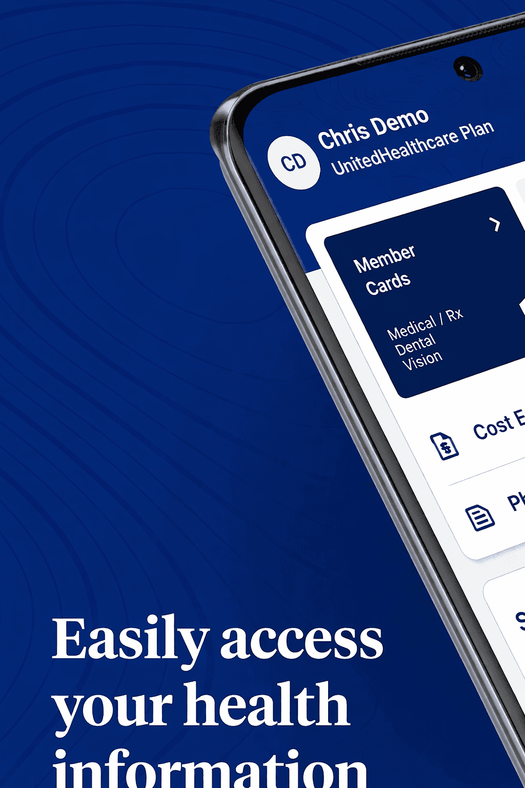
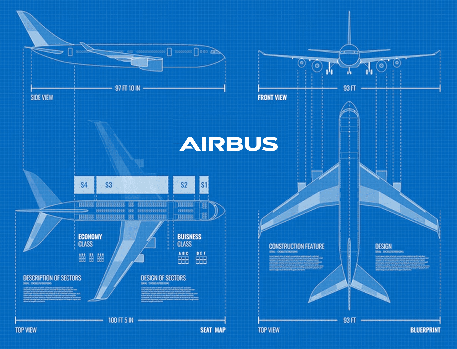
Souvik was an invaluable contributor to the Google PitchHub project, a highly strategic and competitive 8-week pilot showcasing ACN’s [genai] capabilities with Google Gemini AI. His work helped create five high-impact sales demos for prominent clients, including Airbus, UHG, Coca-Cola, Banco BV, and Woolworths – demonstrating ACN’s ability to rapidly scale and deliver cutting-edge solutions. As a UX/UI Designer, Souvik played a critical role in crafting compelling, high-quality design solutions tailored to each demo. His expertise in user-centred design was evident and his ability to collaborate effectively within the team under tight timelines was truly commendable. He demonstrated strong adaptability, seamlessly responding to feedback and refining designs to meet the specific needs of diverse industries and global markets across AMER, APAC, EMEA, and LATAM. Thank you Souvik for your dedication and valuable contributions, your ability to balance creativity, user experience and strategic business impact will be a great asset in your future roles.
Client
Projects
Over the past 5+ years, I’ve had the opportunity to design products across healthcare, finance, enterprise, and consumer domains while working with leading IT consultancies.

Access Now
Building an Inclusive Product with an Accessible Design System, Accelerating Design Handoff by 27%
Revamping a medical product for the US market to ensure ADA compliance and drive wider adoption.
My client, who offers a medicare product suite for the U.S. market, was facing challenges because their offerings were not compliant with the U.S. accessibility requirements. As the UX Lead on this project, I led the redesign of their flagship medical product and conducted UAT with real users of assistive technologies who have visual disabilities.
Client
Wipro (Internal Product)
Duration
6 months
Industry
Healthcare Insurance
Scope of Work
Accessibility Design
Design System
User Acceptance Testing
Objective
A Legacy Platform That Didn't Meet Its Users' Needs
The client had a healthcare product built for Medicare plan members in the U.S, enabling them to manage their health plans, benefits, claims, and payments through a unified digital experience. Medicare plans primarily serve:
Adults aged 65 and older
People under 65 with certain qualifying disabilities
People with long-term medical conditions
Despite serving a user base with significant accessibility and usability needs, the legacy product was neither intuitive for older adults nor accessible to people relying on assistive technologies. The redesign needed to modernise the user experience while achieving WCAG compliance and meeting U.S. accessibility requirements. The goal was to create a senior-friendly, inclusive experience that reduced legal and compliance risk without disrupting existing healthcare workflows.
Discovery
Understanding the Problem Beyond Compliance
Before proposing solutions, I wanted to understand whether the challenges were caused by accessibility barriers, usability issues, or both. I combined expert evaluation, stakeholder insights, and user research to identify the highest-impact opportunities.

Accessibility & Heuristic Evaluation
Reviewed the product against Nielsen Norman usability heuristics and WCAG accessibility guidelines to identify usability issues, accessibility gaps, and inconsistent interaction patterns.

Stakeholder Discovery Workshops
Collaborated with product managers, engineers, and business stakeholders to understand business goals, technical constraints, and recurring feedback received from customers.

Moderated User Testing
Observed users with visual and hearing disabilities completing common tasks using assistive technologies. Through moderated sessions and screen sharing, I identified areas of friction throughout the experience.
Synthesis
Key Research Findings
Findings from user research, stakeholder workshops, accessibility audits, and heuristic evaluation revealed the most critical barriers affecting usability, accessibility, and business outcomes.
01 · Accessibility Barriers Reduced Task Success Rate

Screenshot of the legacy application showing unclear interactive controls, including a text-based "Close" action instead of a standard close icon, and low-contrast table content that reduces readability.
User Quote
"I can't always tell what's clickable, especially when I'm using 400% zoom, and my screen reader doesn't give me enough context."
–User relying on assistive technologies
Supporting Findings
68% of audited screens contained at least one WCAG colour contrast violation.
5 of 6 participants struggled to distinguish tertiary links from supporting text because colour was the only visual indicator.
Business Impact
Increased risk of ADA and WCAG non-compliance.
Lower task completion for users relying on assistive technologies.
02 · Inconsistent Design Patterns Slowed Decision Making

Screenshot of legacy application showing weak button hierarchy and inconsistent input field patterns.
User Quote
"I rely on familiar patterns to navigate. When every screen uses different buttons and form layouts, I have to relearn the interface over and over."
– User relying on assistive technologies
Supporting Findings
7 of 10 audited screens lacked a clear distinction between primary and secondary buttons.
Long forms contained up to 18–24 input fields in one page before users reached the next major section.
Business Impact
Estimated 31% longer task completion time for first-time users.
Higher drop-off during multi-step enrolment journeys.
Greater development effort due to inconsistent UI implementation.
03 · Application Was Not Optimized for Mobile Devices


Mobile view of the legacy application showing a desktop-first interface that was not optimized for mobile, resulting in broken layouts
User Quote
"Our analytics show that more and more users are accessing the platform on mobile, but the application isn't optimized for smaller screens. It's contributing to higher drop-off rates."
– Product Manager
Supporting Findings
WebAIM research shows that 90% of screen reader users access the web using a mobile screen reader, reinforcing the need for responsive, mobile-accessible experiences.
Fixed-width layouts required users to zoom and scroll horizontally to complete key healthcare tasks.
Business Impact
With an estimated 30–40% of users accessing the platform via mobile devices, the desktop-first experience had the potential to affect a significant portion of the customer base.
Increased task abandonment rate during key workflows on smaller screens.
Solution
How I Improved the Overall User Experience
Guided by the research findings, I redesigned the experience to address the most critical accessibility and usability challenges. The following improvements demonstrate how inclusive design principles and WCAG guidelines were applied to create a more intuitive, consistent, and accessible product.
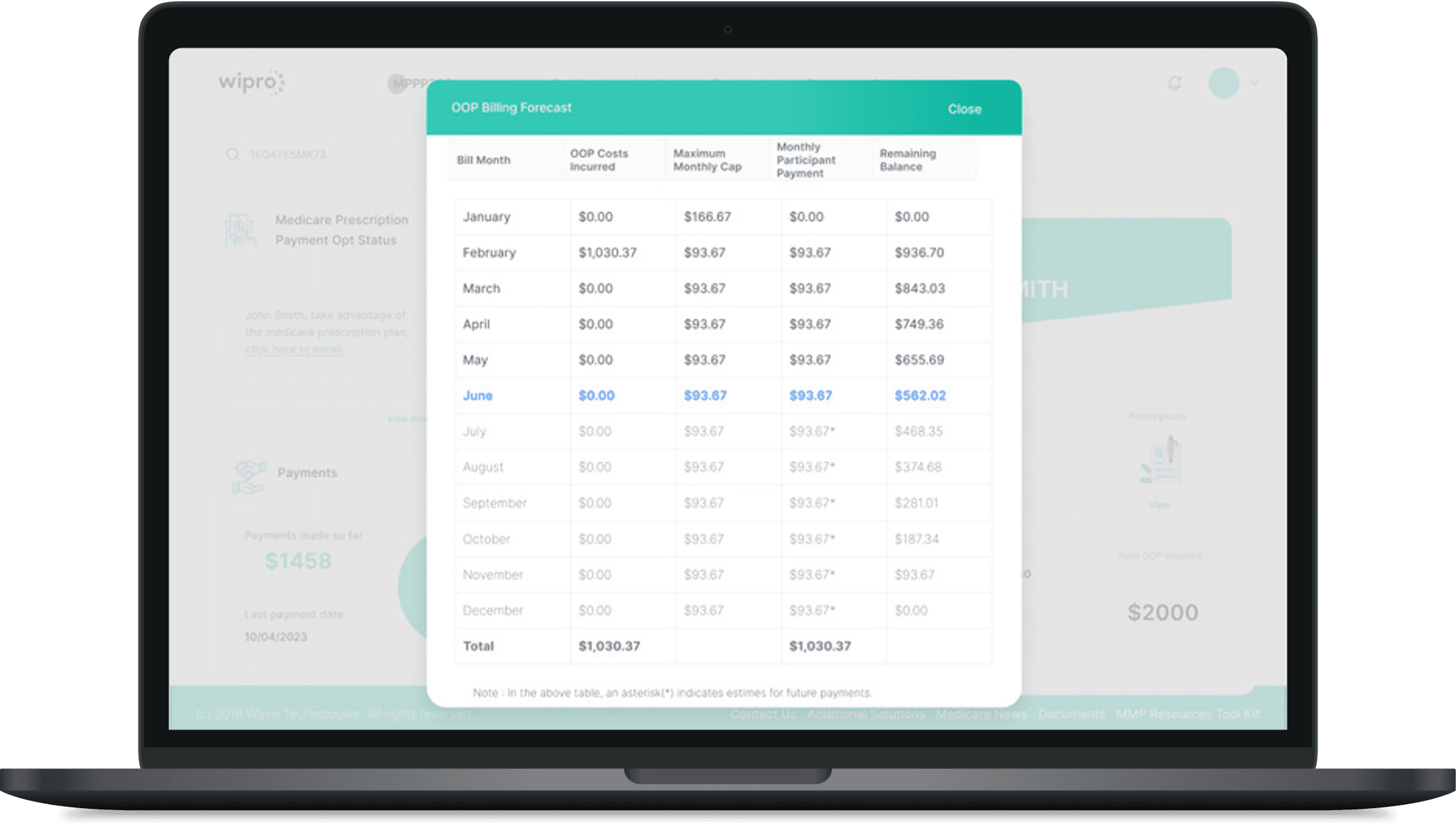
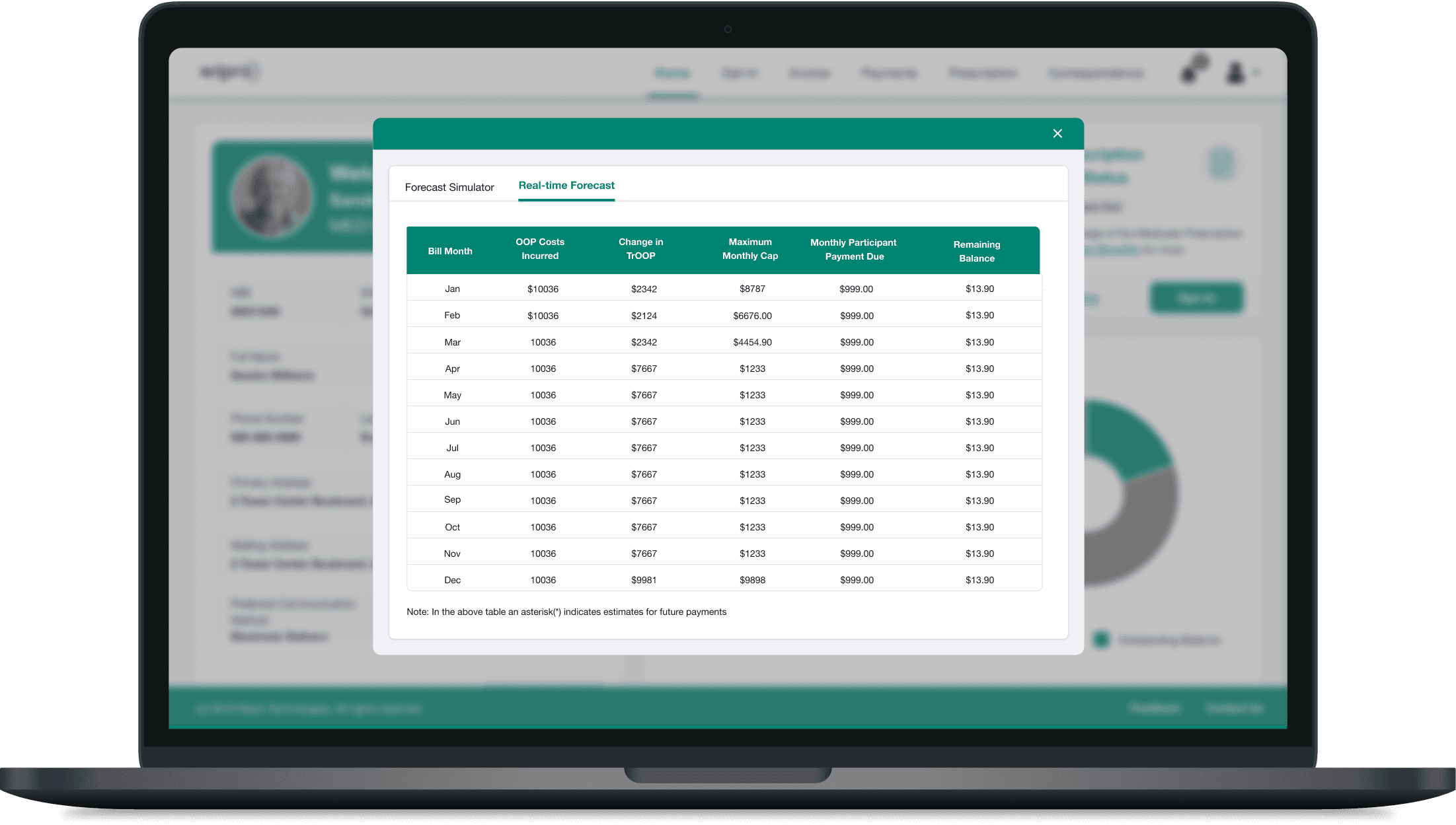
01 · Making Colour Accessible and Readable
Through direct interaction with users who rely on high-contrast settings, I gained valuable insight into their visual needs. These learnings informed the selection of color combinations that meet WCAG standards, significantly improving readability, clarity, and overall usability across the product.
Explore Other Client Projects
Before
After
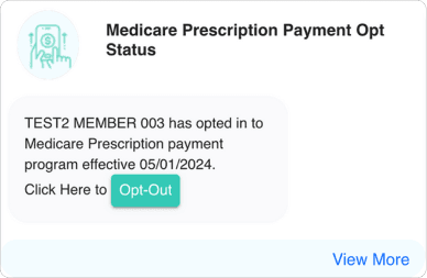
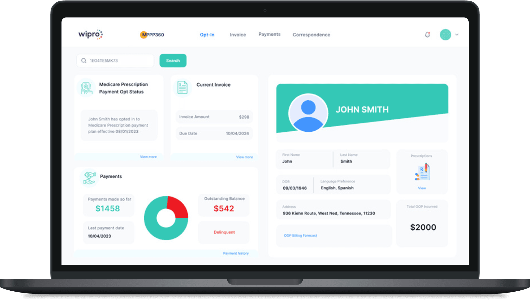
02 · Sructuring Visual Hierarchy Using Gutenberg Principles
Applied Gutenberg’s diagram to establish a clear visual flow and guide user attention toward key actions. By strategically repositioning content and CTAs along natural reading paths, the interface became more intuitive, improving scanability and engagement.
Before
After
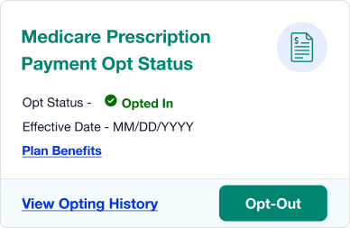
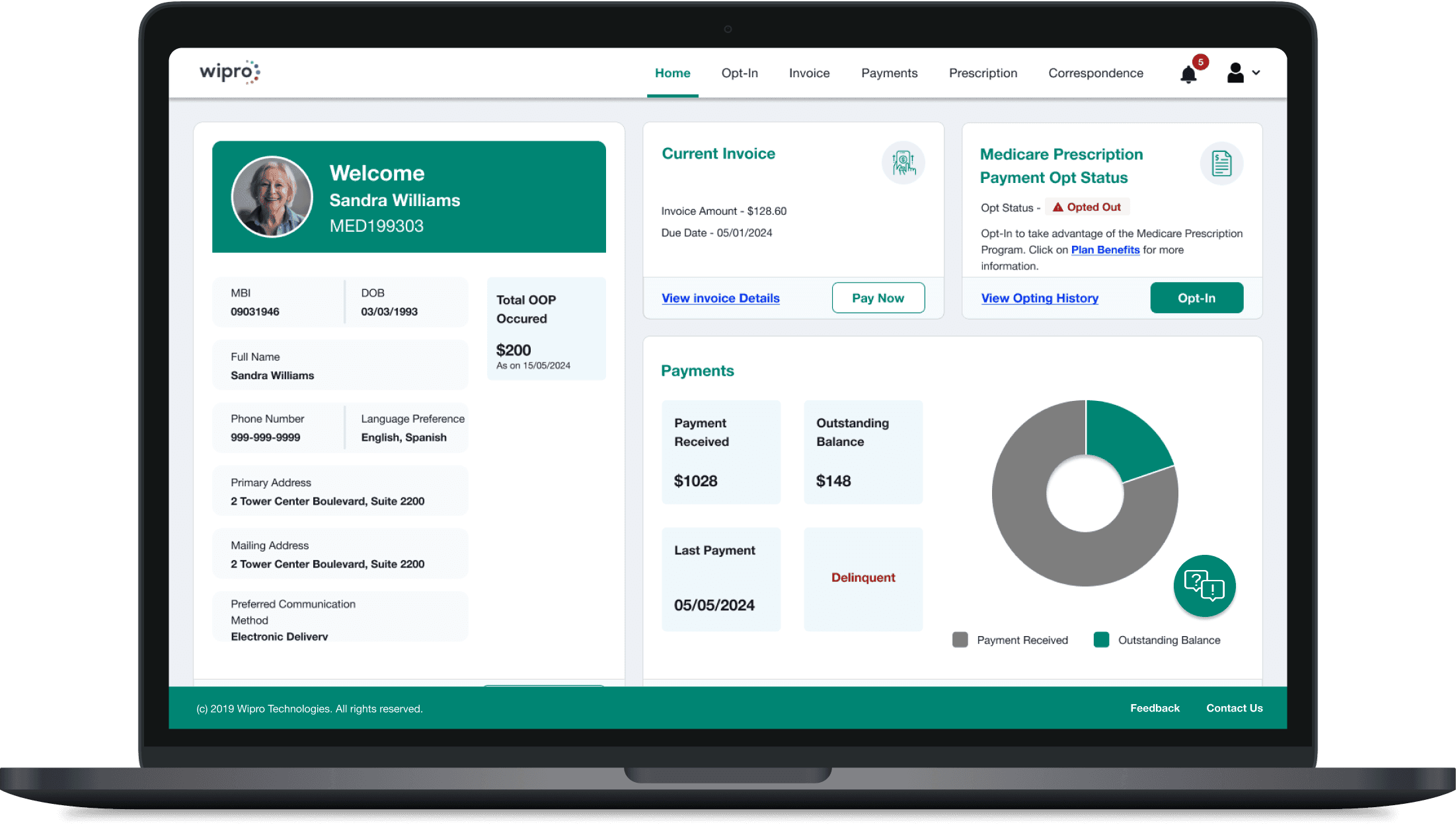
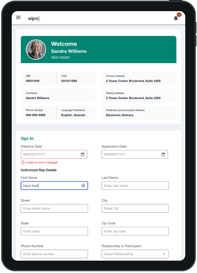
03 · Optimizing UI for Users with Assistive Tech
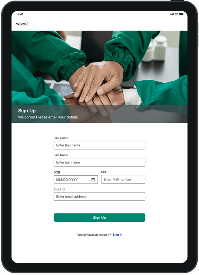
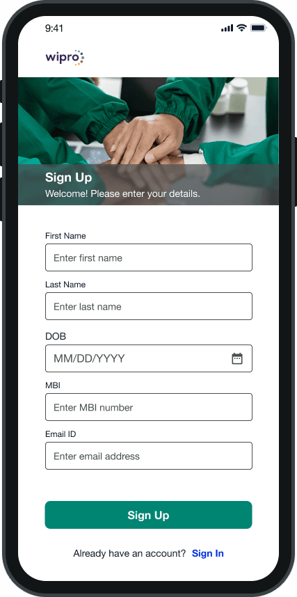
We established descriptive placeholders, persistent labels, and clear error/success indicators. ARIA labels were defined for all interactive elements, ensuring screen reader clarity. These enhancements were embedded into the design system, making accessibility the default standard.
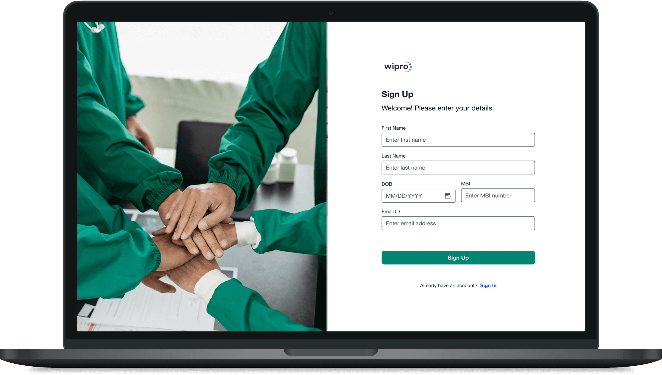
04 · Designing Responsive Experiences Across Breakpoints
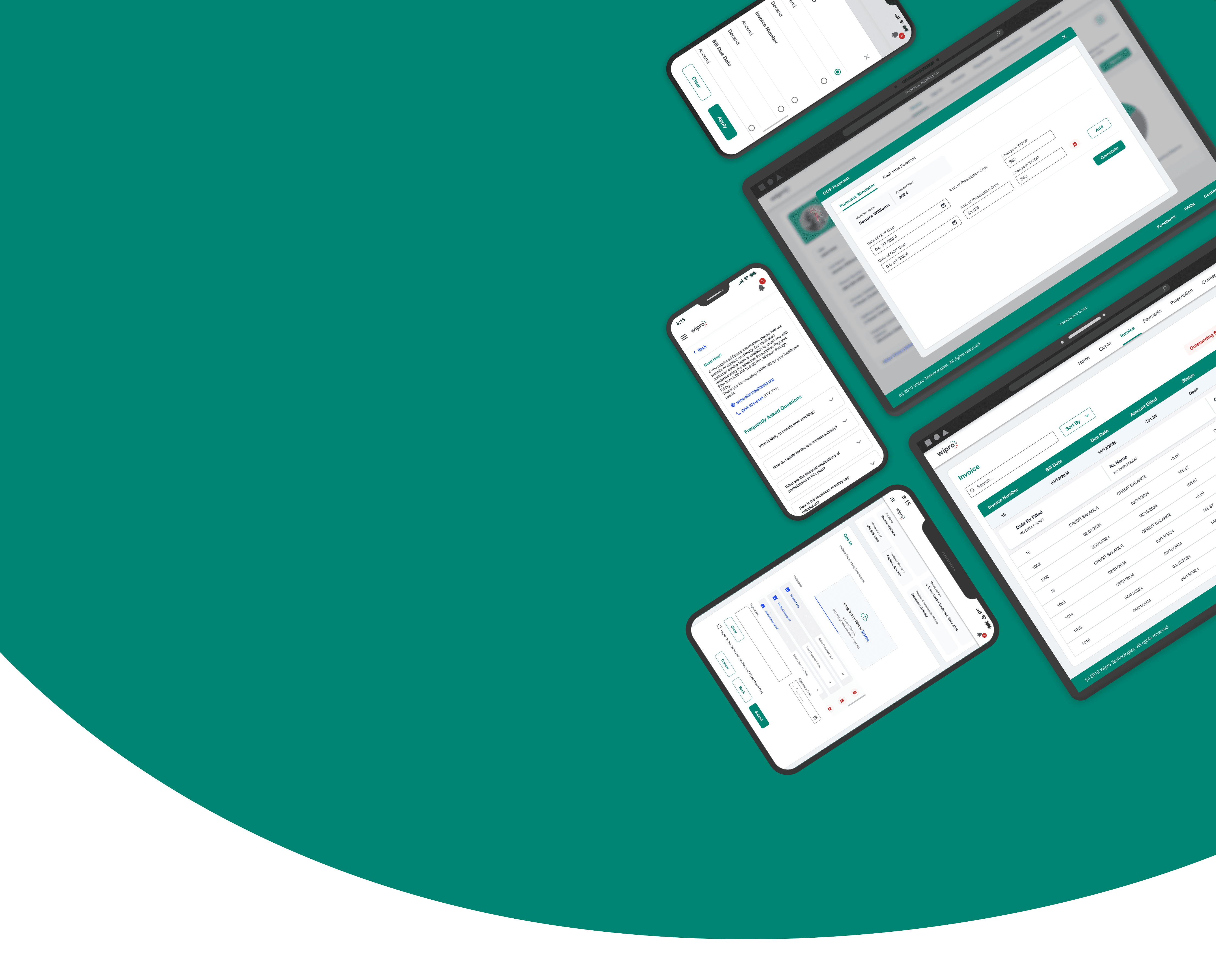
Developed responsive prototypes using defined breakpoints for mobile, tablet, and desktop. Leveraged auto layout and constraints to ensure consistent scaling of layouts, touch targets, and typography, delivering a seamless experience across devices.
Impact
Measurable Business & User Impact
2.2× Better Readability - 67% → 13% task failure rate for users with low vision through improved colour contrast and inline validation.
Validated through: Moderated usability testing
27% Faster Design Handoff - A shared design system and reusable components reduced design-to-development handoff time.
Measured through: Data from scrum master
Better Action Recognition - CTA recognition improved from 1 in 3 to 4 in 5 users with disability through clearer button hierarchy and interaction states.
Measured through: Moderated usability testing
Reflection
How This Project Changed My Thinking
This project challenged a few assumptions I had and changed how I think about designing accessible, scalable products.
01 · Accessibility is Becoming an AI Readiness Strategy
Accessibility now benefits both humans and AI. Accessible, semantically structured products are easier for both users and AI to understand. With Gartner forecasting a 25% decline in traditional search by 2026, accessibility is becoming a competitive advantage, not just a compliance requirement.
02 · Design Systems are Becoming a Business Investment
While researching how to demonstrate the value of investing in a design system to the client, I discovered that its benefits extend far beyond design consistency. Figma found that designers complete tasks 34% faster using design systems, while Forrester reported 20–30% higher developer productivity. It changed how I view design systems, from a design initiative to a strategic business investment.
03 · Consistency Matters Most When Designing for Older Adults
One insight that stayed with me was that older adults rely heavily on consistency. Research from Nielsen Norman Group found that predictable interaction patterns help older users build confidence and complete tasks more successfully. It reinforced that consistency is more than a design principle, it's a usability tool.

Aero Check
Designing an AI-Assisted Validation Tool That Increased Processing Speed by 3.3×
As a consultant, I worked on a pilot project for Airbus to demonstrate how AI could assist in validating complex manufacturing diagrams. The goal was to explore how AI could reduce manual effort by identifying missing or inconsistent information and supporting engineers with a faster, more reliable validation workflow.
Client
Airbus
Duration
4 Weeks
Industry
Aviation
Scope of Work
AI-Driven
Enterprise Saas
No-code
Objective
Making Manufacturing Diagram Validation Faster Without Compromising Engineering Confidence.
Engineers previously validated diagrams manually by comparing drawings against Bill of Material (BOM) data and supporting information. The repetitive process made validation time-consuming and required engineers to repeatedly cross-reference multiple sources. The objective was to reduce validation time by automating repetitive comparisons while ensuring every AI recommendation remained transparent, reviewable, and under human control.
Business Impact
Reducing Validation Time by 70%.
By shifting repetitive comparison work from manual checks to an AI-assisted workflow, engineers could spend less time searching and reconciling information and more time reviewing the results that require their expertise.
3.3X Faster
Streamlined diagram validation by reducing repetitive manual comparisons across drawings and Bill of Material (BOM) data.
Discovery
Understanding How Engineers Validate Manufacturing Diagrams
I spoke with engineers involved in diagram validation to understand how they review drawings, compare them against BOM and engineering data, and investigate discrepancies across supporting documentation.
Cross-Referencing Engineering Data
(01)
“...I need to check the drawing with the BOM and master data, especially the P/N, quantity and parameters. Sometimes I have to pivot between different data sets to understand where the deviation is coming from...”
-Design Engineer
Insight- Validation requires cross-referencing multiple engineering data sources and attributes, not just matching a part number.
Making Validation Traceable
(02)
“...when there is a missing or validation deviation in the Post-BOM, I want to know what was compared, which validation rules were applied...”
-Design Engineer
Insight- Engineers need a traceable validation trail showing what was checked, which rules were applied, and where human review is still required.
Establishing Document Relationships
(03)
“...for one part there can be the drawing, BOM and other technical data. I need to check the revision, configuration and document mapping before I know which information is valid for the component...”
-Design Engineer
Insight- Engineers need relationships between drawings, BOMs and technical documents to determine which data should be trusted.
Tracing the Source of AI Recommendations
(04)
“...if the AI suggests a different material, supplier or P/N, I need to see where it got the information from. I cannot just accept the suggestion if I can’t confirm the source data...”
-Design Engineer
Insight- AI recommendations need source-level evidence so engineers can assess and trust the suggested value.
Analysis
Three Core Requirements for the Solution.
The analysis distilled the recurring needs across the validation process into three essential pillars for the solution.

Data Comparison
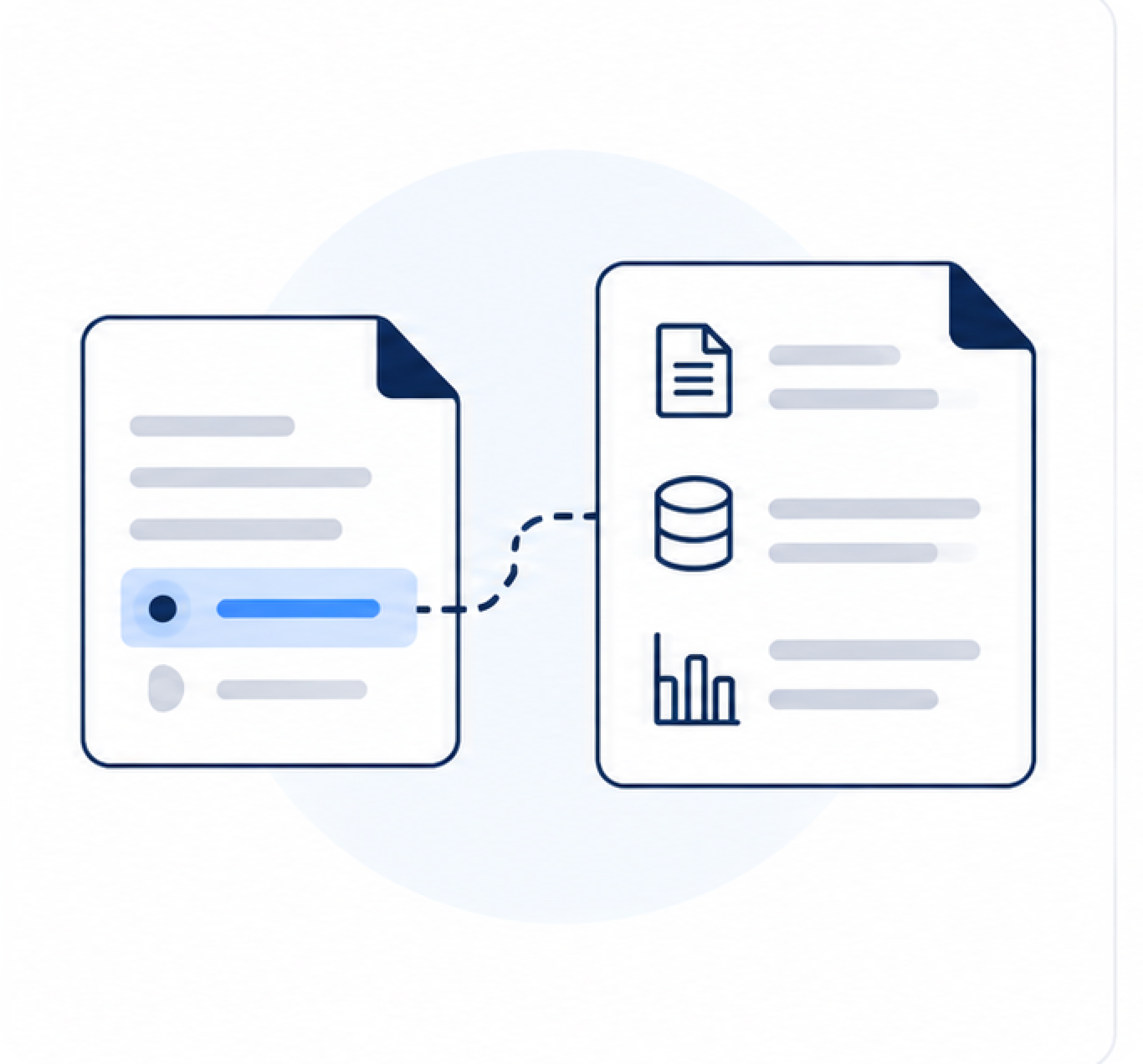
Compare the manufacturing diagram against BOMs, revisions, configurations, and other engineering data.
Deviation Resolution
Identify missing or conflicting information and determine the appropriate resolution.

Source Traceability
Show the source and evidence behind each finding or AI recommendation.
Interaction Workflow
Mapping How Engineers, AI, and Data Work Together.
I mapped the validation journey to define how engineers and AI interact across the primary flow and key exception scenarios, from data comparison and discrepancy detection to review, confirmation, and override.

The workflow illustrates one primary review process alongside four supporting scenarios: missing values, AI-confirmed suggestions, manual overrides, and re-review before submission. Bringing these together in a single map helped align product, design, and engineering before prototyping.
Design Advocacy
How I Proposed AX Principles to Build User Trust.
The development team initially focused on surfacing the AI result. I used three concepts to demonstrate why engineers also needed the source, reasoning, validation context, and clear paths when AI succeeds or fails.
01 · Contextual Feedback
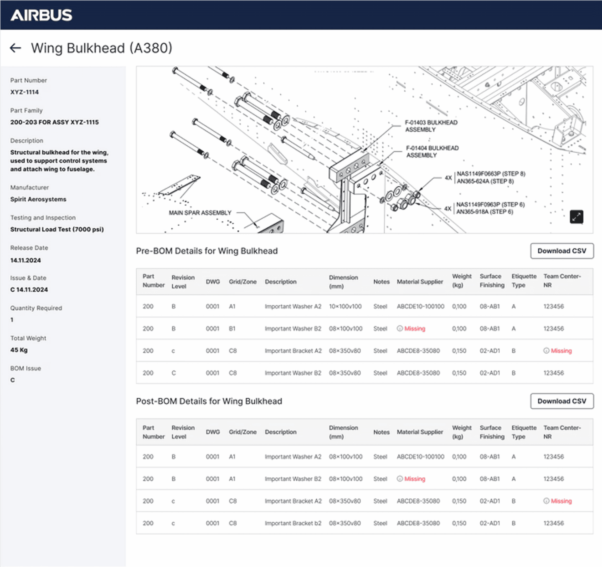
When the system detected a mismatch, such as a part number in the manufacturing diagram not matching the Bill of Materials (BOM), I highlighted the exact region in the diagram and displayed the conflicting BOM entry alongside it. Engineers could immediately validate the issue without searching through lists or switching screens.

02 · AI Transparency and Explainability
When the system automatically resolved missing information by retrieving data from another source file, I surfaced the action together with its source. Engineers could review, confirm, or reject the AI recommendation instead of relying on silent automation.

03 · Human AI Handoff
Instead of showing a generic "Needs Review" state, I displayed the validation steps performed, the data sources consulted, and why the issue remained unresolved. Engineers could continue from where the AI stopped instead of repeating the investigation.

Wireframe to High Fidelity
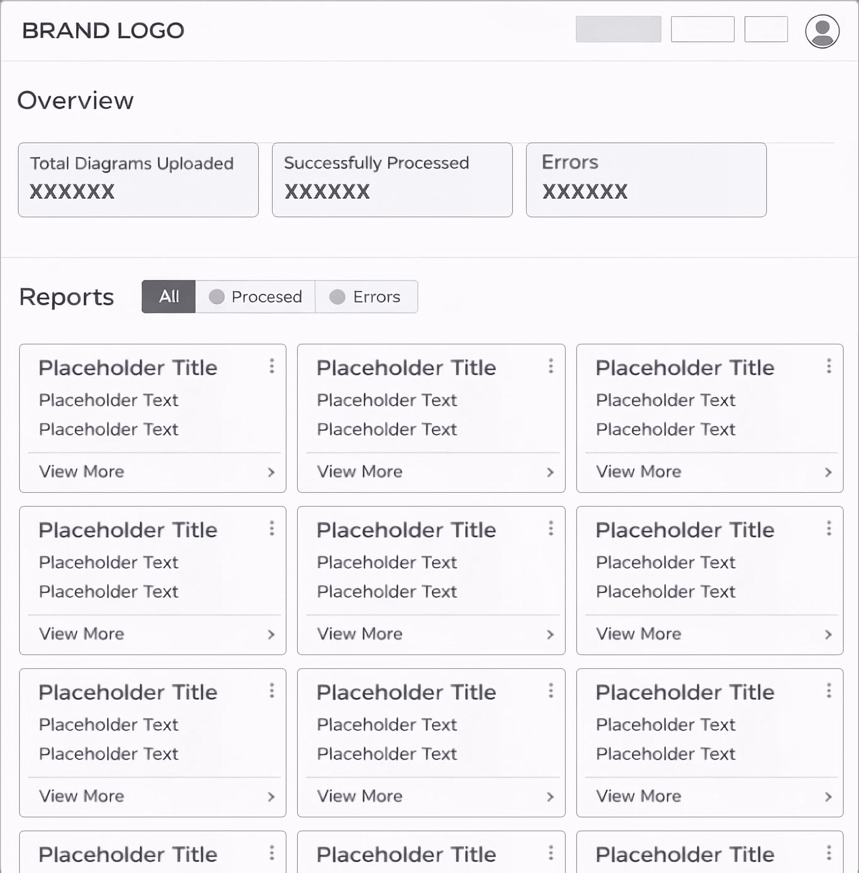
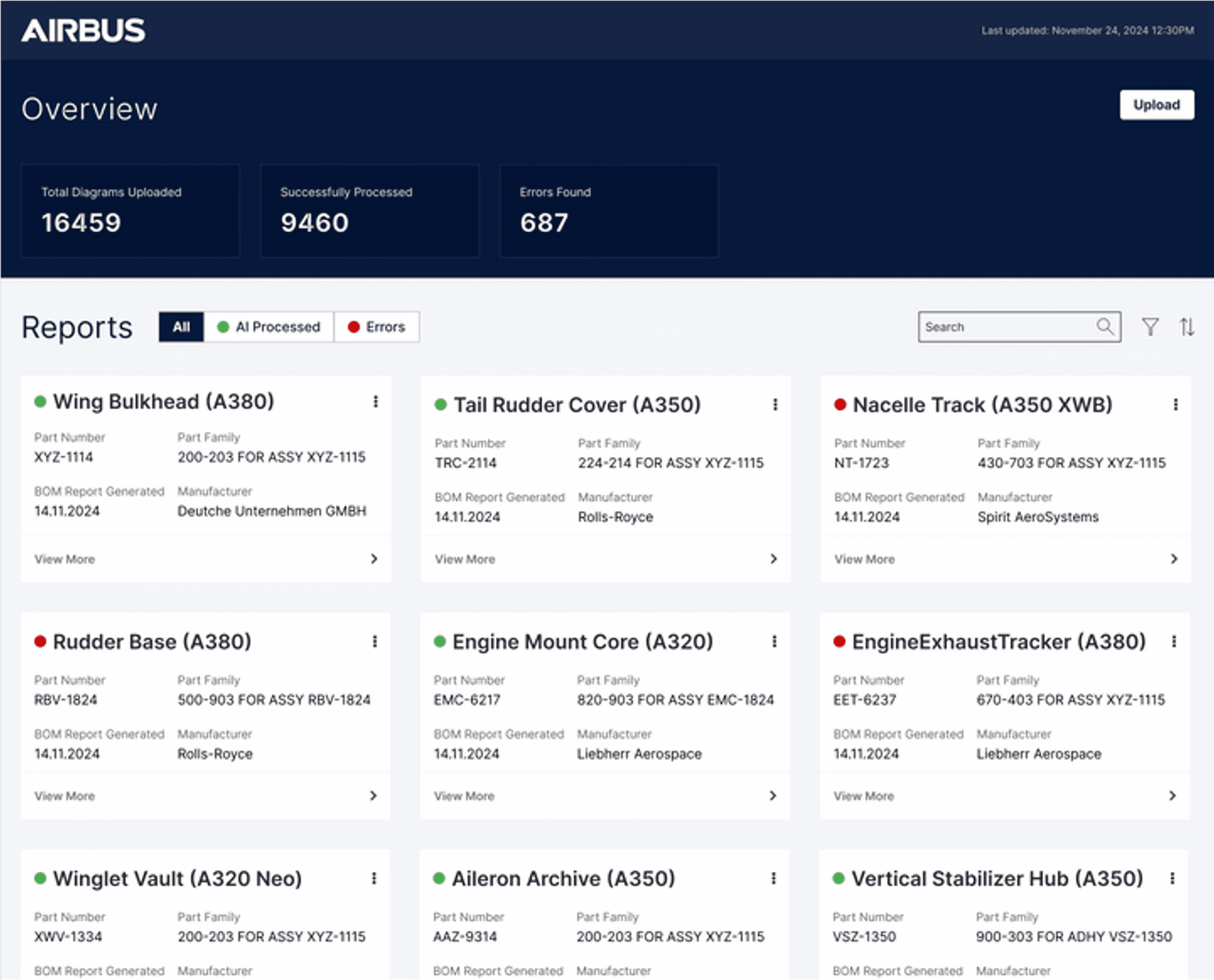
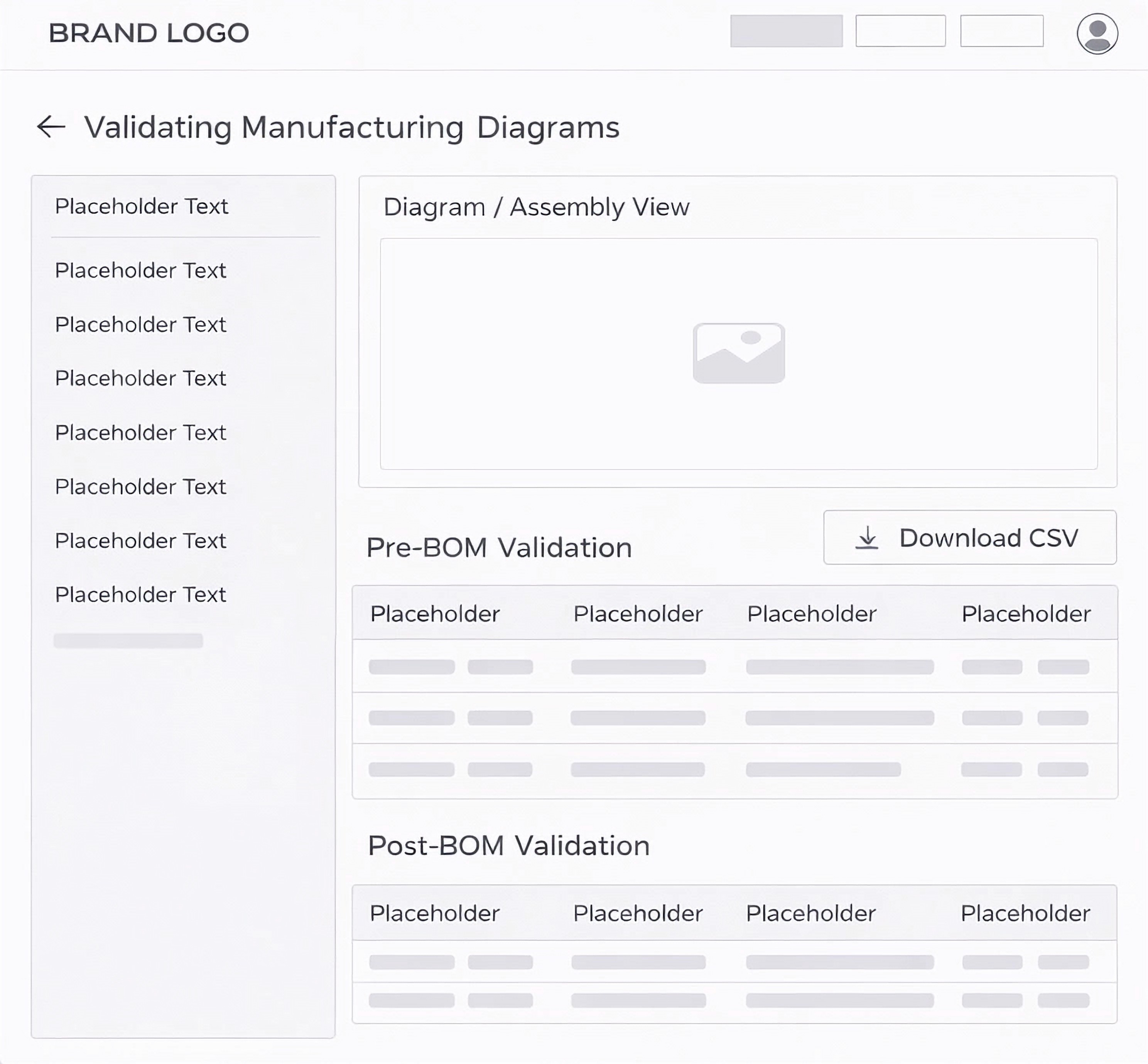
For this project, we began by creating quick wireframes to ensure alignment and shared understanding across the team. Once aligned, we developed high-fidelity Figma prototypes, all while keeping in mind the constraints of FlutterFlow, the no-code platform we used to deliver the final product. This ensured the design was both realistic and achievable from concept to final build.
Prompt to Code
For the project, we originally built it in FlutterFlow, but for the purpose of showcasing it in my portfolio, I created a working prototype using Claude.
Explore Other Client Projects

Member Portal
Data-Driven Digital Transformation of a Healthcare Insurance App with 5M+ Downloads on Google Play
As a Product Designer at an Indian consultancy, I worked on a 1.5-year project with a leading healthcare insurer. Starting with a UX audit, we rebuilt their incomplete mobile app from scratch with a new IA and new components in the design system.
Client
United Healthcare Group
Duration
18 months
Industry
Healthcare Insurance
Scope of Work
App Design
Information Architecture
Design System
Objective
Closing the Gap Between Portal and Mobile
The client's insurance agents work in the field, not at a desk, and had decided to make mobile their main channel. But the app was still missing features the legacy web portal had, so agents kept getting pulled back to desktop. Closing that gap is why I was brought on.
Users Leaving Mid-Task
Mobile drop-off ran well above what the portal saw for the same actions.Support Absorbing the Overflow
Over 15,000 calls a month came from members who got stuck on the app.Half the Portal Wasn't on Mobile Yet
Several web portal features hadn't made it into the app, so agents had to switch back to desktop to finish the task.
Discovery
UX Audit & Key Findings
Before touching any screens, I ran a UX audit against NN Group heuristics and cross-checked it with two quarters of analytics and support ticket data. Four patterns kept showing up, and each one was quietly costing the business money.

Complex Navigation
"I know this feature exists somewhere, I just never know which menu it's hiding in." — Product Analyst
Users took 4 to 6 taps to reach screens that should've taken 2. Every extra tap meant more people abandoning the task, and abandoned tasks were flowing straight into support call volume.
Unclear Call-to-Action
"I wasn't sure if tapping that would submit my claim or just save it."
— Insurance Agent
About 3 in 5 users hesitated or picked the wrong action on core screens during user interviews. Second-guessing what a button does slows every client interaction and erodes trust in the tool itself.


Complex Form Structures
"On mobile I have to scroll left and right just to fill out one form. I'd rather just do it on desktop where I can see the whole thing at once." — Insurance Agent
Claims and enrollment forms had the highest drop-off in the app, around 40%. Biggest single driver of support calls.
Lack of Search Functionality
"It takes me longer to find the record than to actually do the work." — Support Staff
Finding the right plan took over 90 seconds on average. Instead of finishing on their phone, members gave up and switched to desktop.
Solution
Solutions Mapped to the Audit Findings
Each fix below responds directly to a finding from the audit. The goal wasn't a redesign for its own sake, it was to solve the specific problems agents were already running into every day.
01 · Fixing the App's Information Architecture
Agents couldn't find things because the app was still running on the same information architecture as the web portal, a structure built for a desktop screen where everything is visible at once, not a phone. I rebuilt the IA from scratch based on real usage patterns.
Solution Highlights
Ran card sorting sessions to see how agents naturally grouped features
Reorganized 40+ screens into 5 task-based groups, cutting navigation depth by half
Validated the new structure with tree testing before wireframing
Explore Other Client Projects
02 · Setting Navigation Hierarchy from Google Analytics Data
With the new structure in place, I still had to decide what agents saw first. Rather than guess, I pulled Google Analytics data on page views and engagement time and let actual usage set the order.
Solution Highlights
Pulled Google Analytics data on page views and engagement time across the app
Ranked features by actual usage, not internal opinion
Placed the most-used features in the bottom navigation bar for one-tap access
Ordered the hamburger menu to match, most used to least
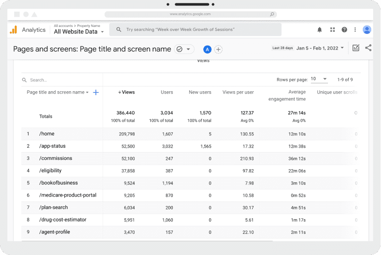
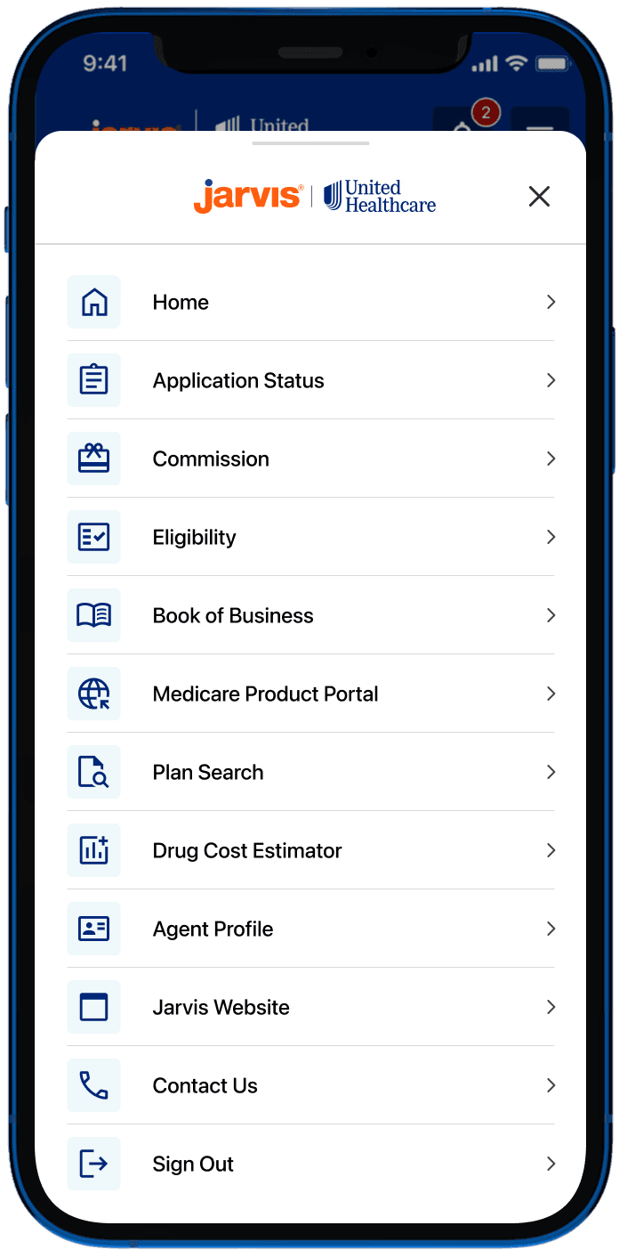
The most visited pages identified in Google Analytics (left) were used to determine the hierarchy of items in the hamburger menu (right), aligning navigation with real user behavior.
03 · Building Mobile Components for the Design System
There was no mobile component library, so developers were defaulting to their own solutions screen by screen. I extended the client's existing design system instead of building a new one from scratch.
Solution Highlights
Audited the existing design system to understand tokens and patterns already in place
Built mobile-specific components extending the system, not replacing it
Covered buttons, form fields, cards, navigation elements and interaction states
Standardized CTA labels to improve action clarity and consistency
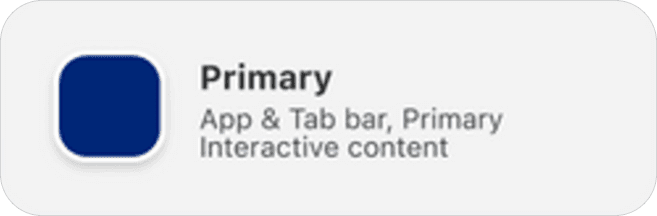
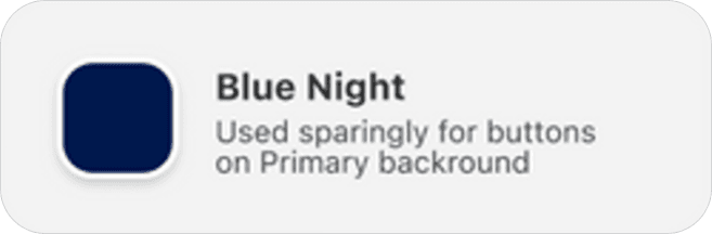
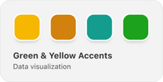
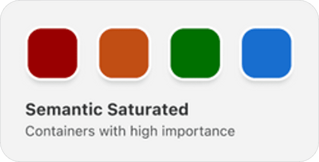

04 · Turning Long Forms Into Guided Steps
Using the form field components just built in the design system, I broke a multi-column desktop layout into something a phone could actually handle.
Solution Highlights
Switched to single-column layouts, removing horizontal scroll entirely
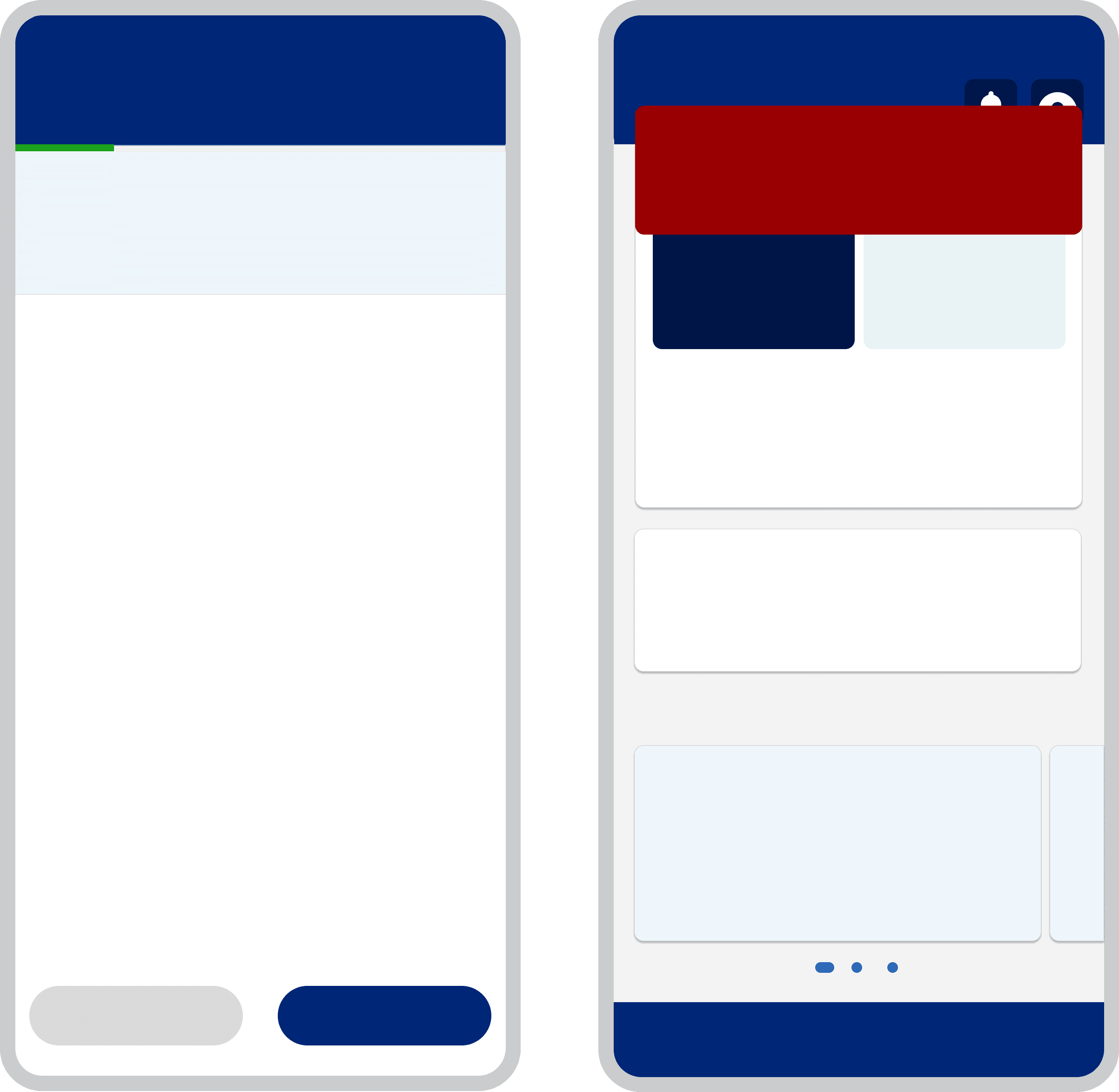
Broke long forms into labeled steps with a visible progress indicator
Designed immediate success and error feedback instead of post-submission validation.

Wireframes were initially developed to align the team on the application's structure and user flow. These were then evolved into interactive prototypes that communicated transition states and user interactions, enabling consistent implementation by developers.
05 · Introduced Search & Filtering to Improve Data Discovery
Finding the right claims data or check application took over 90 seconds, so agents gave up and switched back to desktop. There was no way to search or narrow down long lists.
Solution Highlights
Defined search and filter categories based on business workflows and stakeholder requirements.
Designed clear empty, loading, and no-results states for search experiences.
Defined filter chip behavior, multi-select patterns, and clear/reset interactions.
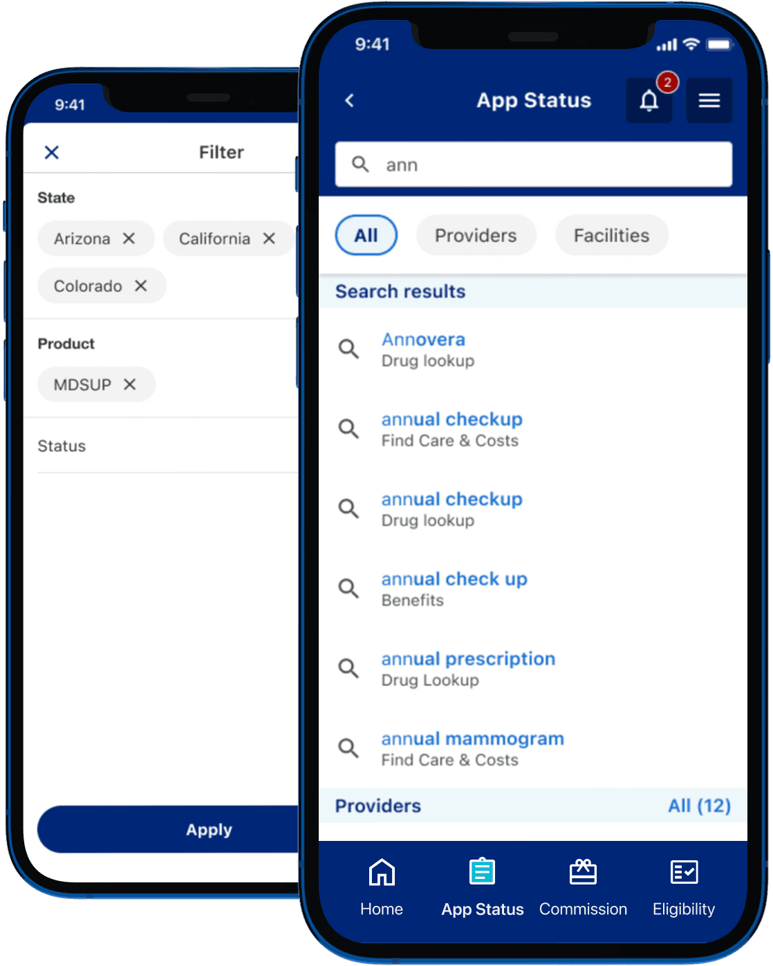

Stakeholder workshops for the Application Status page defined the search, filtering, and sorting experience, which was translated into the final UI shown on the right.
Impact
Measurable Business & User Impact

Higher User Engagement
Mobile app usage increased by 12% within the first month, with more insurance agents choosing the mobile app as part of their daily workflow.
Validated using: Google Analytics

Improved Accessibility
Lighthouse Accessibility Score improved from 68 to 91, reflecting a more accessible and inclusive experience across the redesigned member portal.
Validated using: Lighthouse, Axe & manual accessibility testing

Faster Task Completion
Task completion time improved by 24% during usability testing, with simplified navigation and fewer interaction steps reducing the time required.
Validated using: Moderated usability testing
Reflection
What This Project Taught Me
Beyond improving accessibility and responsiveness, these are three lessons I'll carry into future projects.
01 · Design Decisions Need Evidence
Working on this project changed how I approach product decisions. During the redesign, different stakeholders had different views on which features should appear in the bottom navigation and the hamburger menu. Rather than relying on opinions, we used product analytics to understand which features users accessed most frequently and structured the navigation around actual behaviour. It reinforced that analytics isn't just a reporting tool, it's an essential input for UX decision-making.
02 · Platform Shapes Information Architecture
When I joined the project, the mobile experience was based on the same information architecture as the web portal. The same structure that worked well on desktop created unnecessary complexity on mobile. Designing around the mobile context resulted in a simpler navigation model and quicker access to frequently used features.
02 · Alignment Is Part of the Design Process
Adding search, filtering and sorting seemed straightforward until business expectations and technical constraints diverged. Running collaborative stakeholder workshops helped us prioritise features that delivered the most value while remaining technically feasible. It changed how I think about design. It's not just about creating interfaces, but also about aligning people around practical solutions.
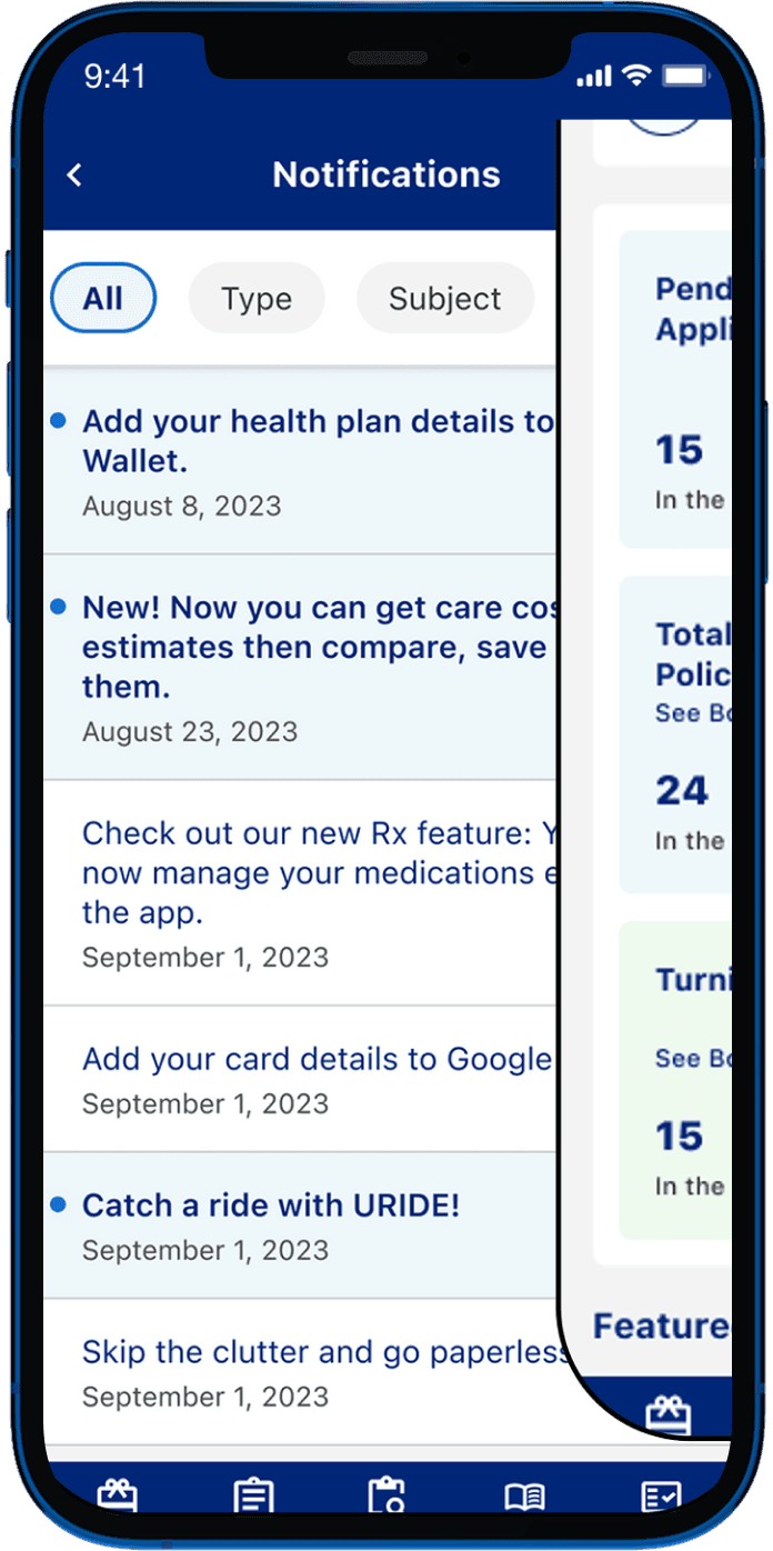
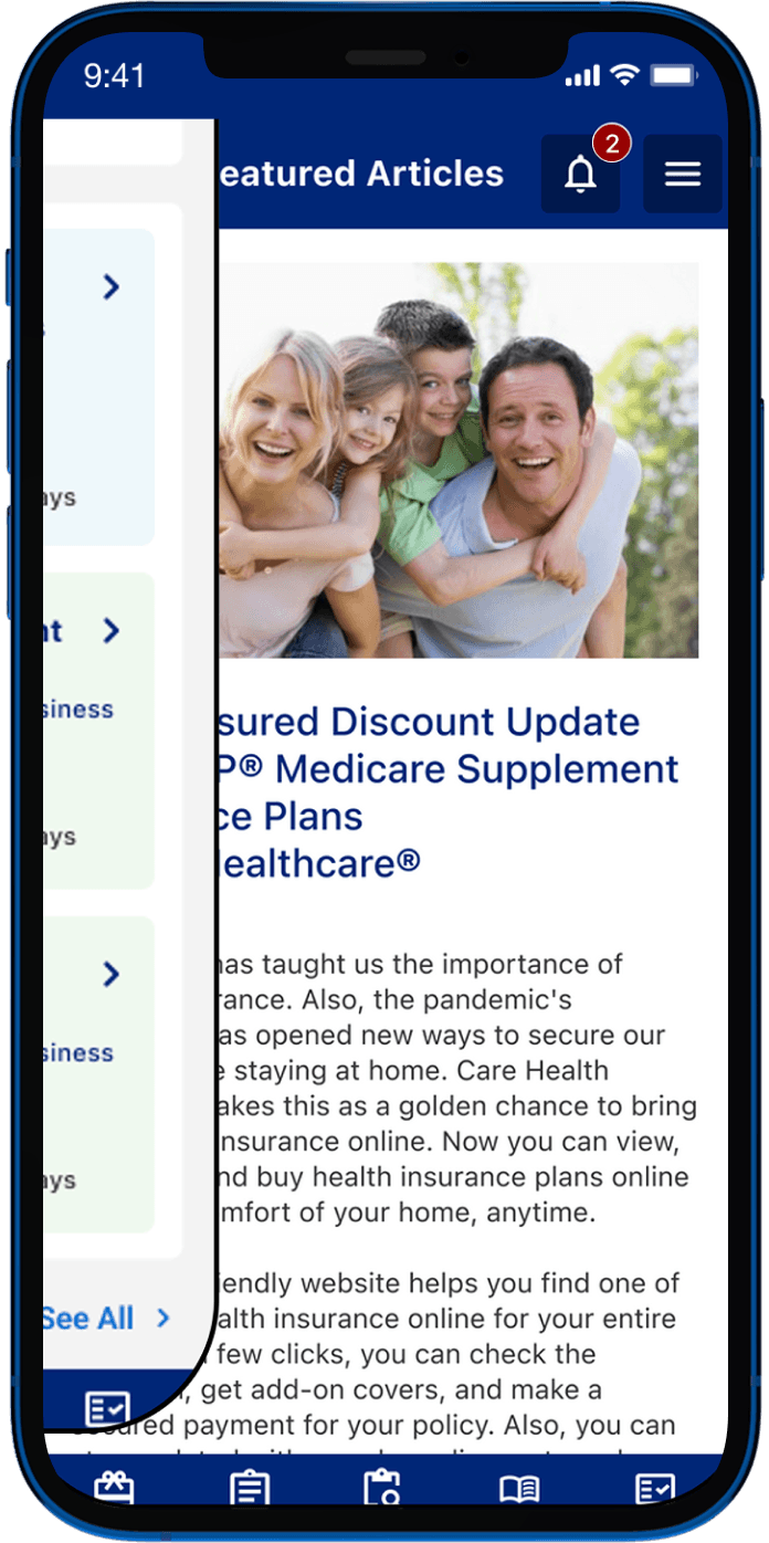
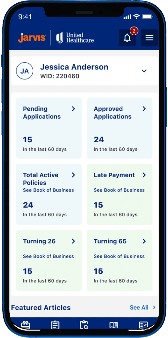

Desi Aroma
Women's Empowerment Initiative
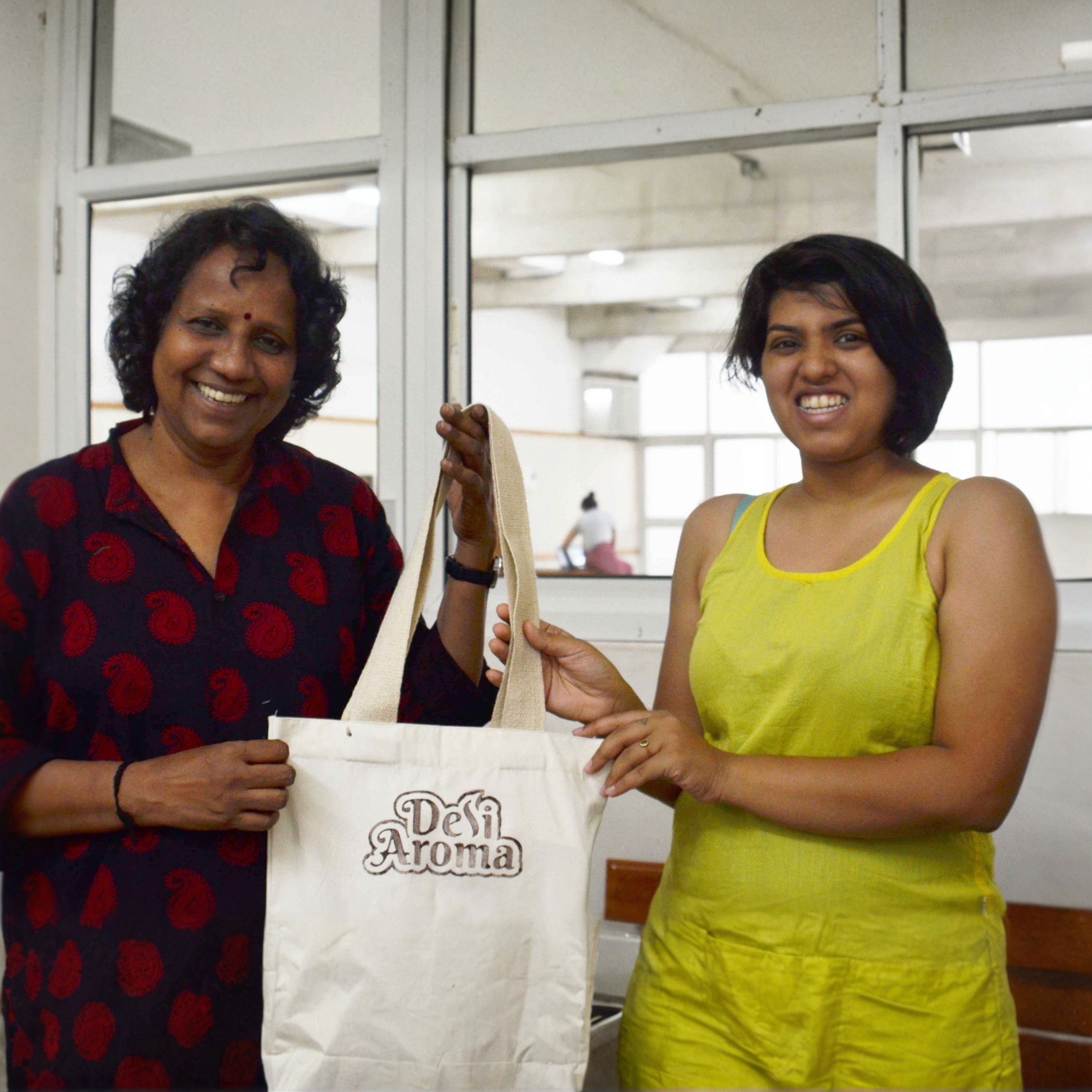
Founded by two NID alumni, Desi Aroma is a community-driven initiative that empowers housewives in Gandhinagar by transforming their love for home-cooked food into a source of income and recognition, while serving affordable, wholesome meals to students.
Client
Student Project
Duration
2 Months
Industry
Social Innovation
Scope of Work
Service Design
System Design Design
Brand Design
Mobile App
UX/UI
Video Production
🏆 Second Runner-Up User Interface Design Category

From concept to scalable experience.

Objective
Creating Economic Opportunities for Housewives While Meeting Student Needs
Many women in Gandhinagar were looking for flexible ways to earn an income while managing their families, while many students lived away from home and missed the comfort of home-cooked food.
We saw food as the natural connection between these two communities and explored how homemade food could bring the feeling of home to students while creating flexible earning opportunities for women.
System Mapping
System-Level Analysis of gandhinagar
Primary & Secondary Research • Focus Groups • System Mapping • Insights Articulation • Opportunity Mapping
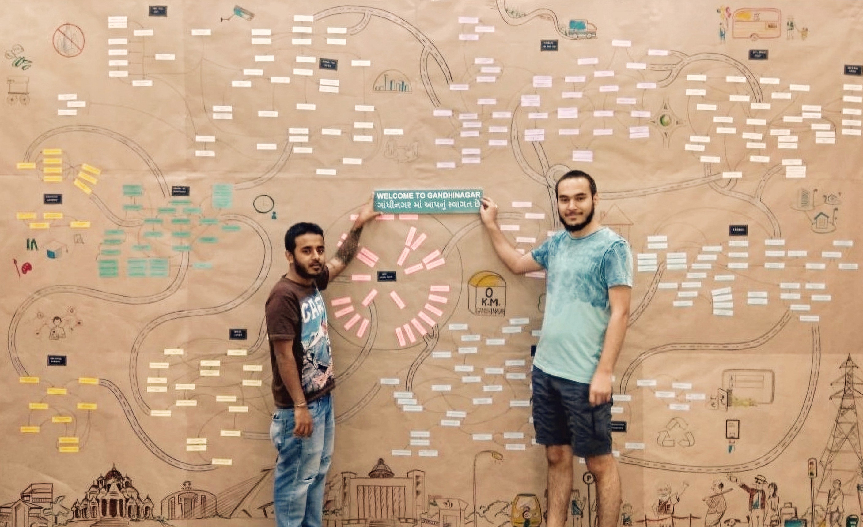
The above shows a system map of Gandhinagar.
User Research
From Observations to Insights
Synthesizing user interviews and discussions to uncover patterns, needs, and opportunities that informed design decisions.
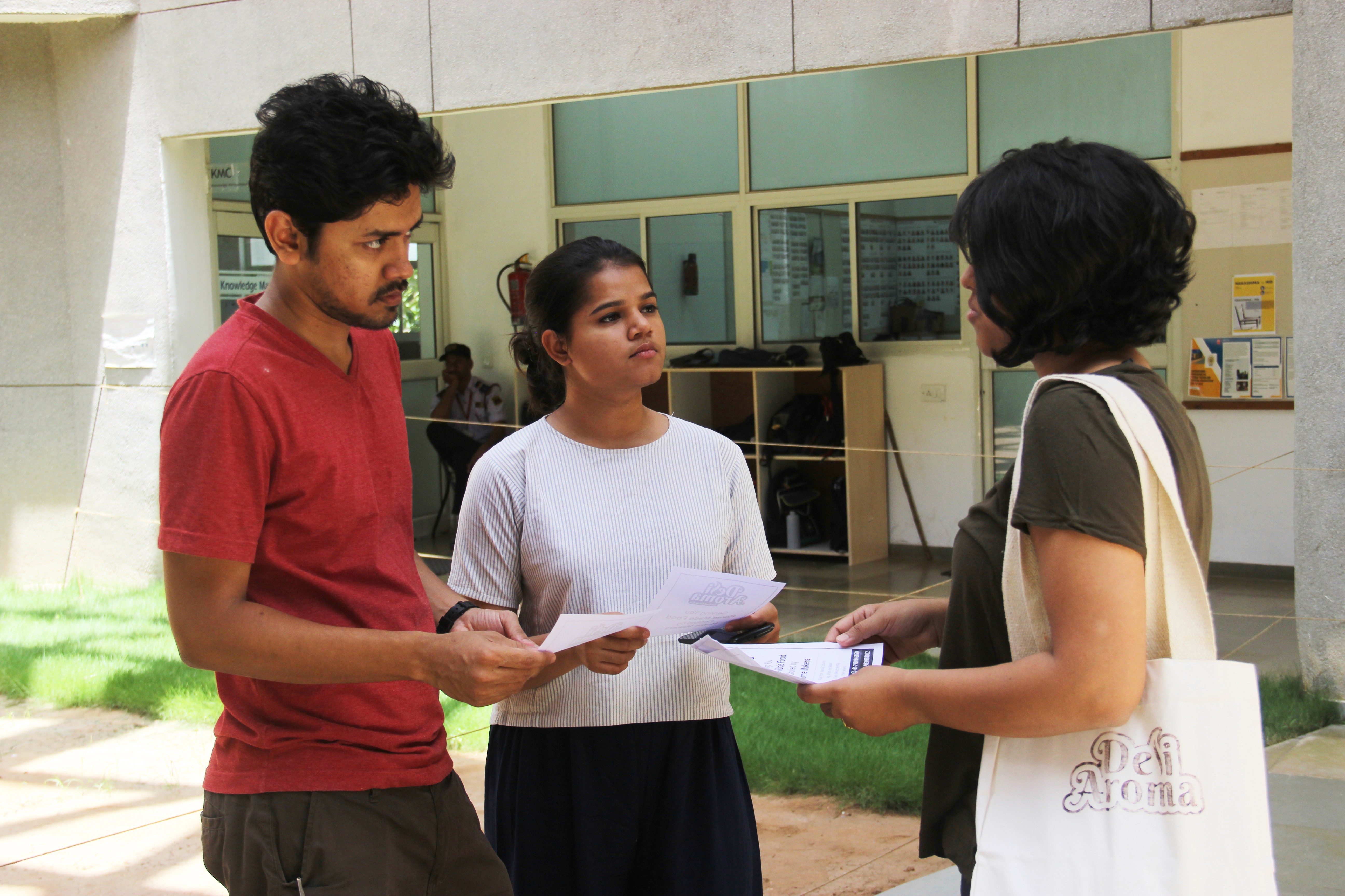
- Limited time to cook → dependence on restaurants
- Carrying home-cooked food leads to cold, soggy meals
- Strong need for fresh, homemade food
- Existing services lack authentic home-style taste
- Willingness to pay ₹100–₹150 for non-veg meals
- Cost sensitivity; preference for simple packaging
- Quantity transparency expected in online menus
- Demand for personalization and portion options
- Family approval is critical for homemakers' participation
- Homemakers' schedules revolve around family needs
- Retired individuals seek meaningful engagement
- Stored homemade snacks fit anytime consumption needs
- Cook selection is key to consistent homemade taste
- Limited local market → right customer targeting needed
- Importance of tracking customer preferences
- Loyalty requires assurance and stability for home chefs
Comparative Analysis
From Existing Services to New Opportunities
Benchmarking existing food services to understand the landscape, gaps, and opportunities for a community-driven model.
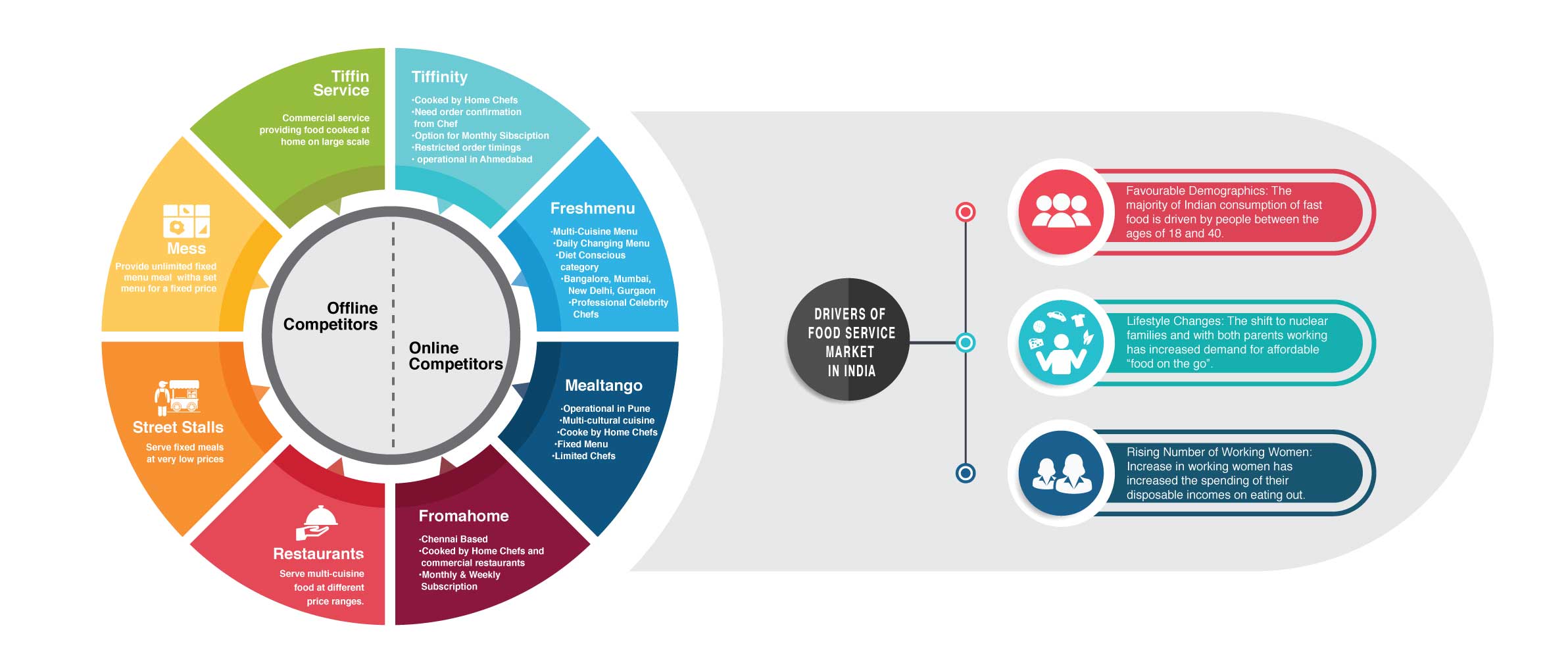
*Original artifacts shown as-is in 2018, not recreated. Please use the custom-built zoom feature to view the research text in detail.
Stakeholder Mapping
From Stakeholders to Service Ecosystem
Mapping key stakeholders, relationships, and interactions to understand how the service could function within the wider ecosystem.
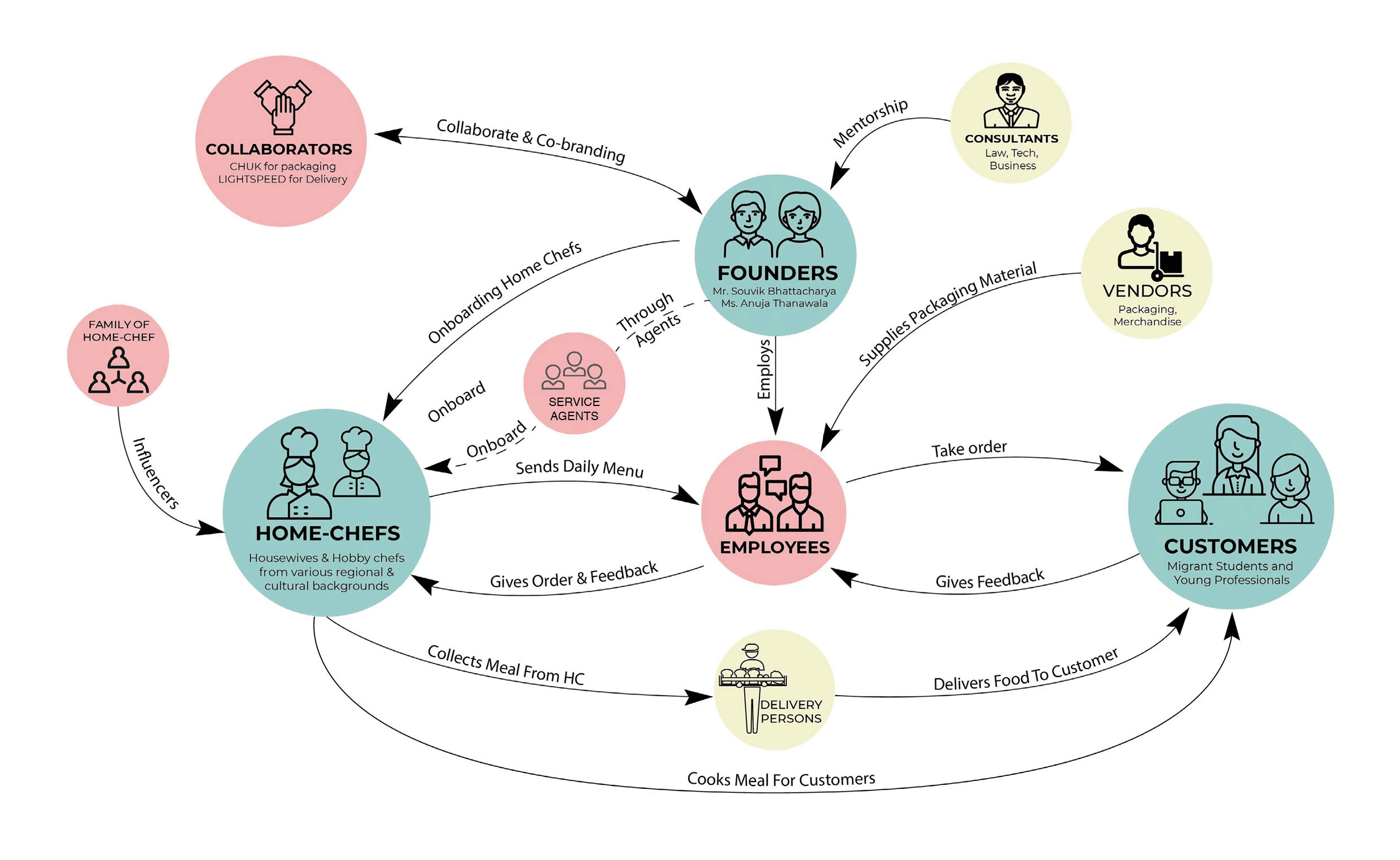
*Original artifacts shown as-is in 2018, not recreated. Please use the custom-built zoom feature to view the research text in detail.
Journey Mapping
From Individual Journeys to Shared Experiences
Mapping the end-to-end experiences of home chefs and customers to uncover pain points, expectations, and opportunities.
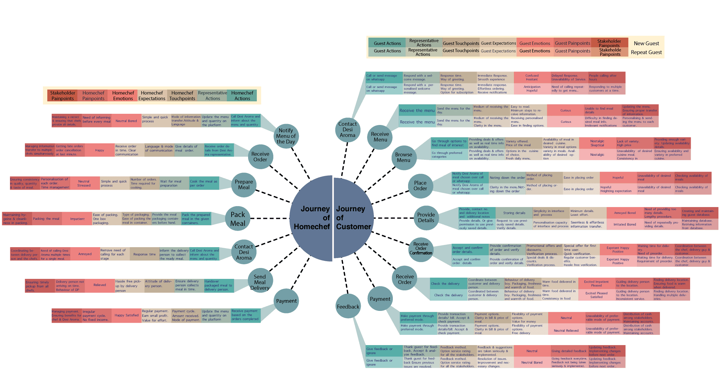
*Original artifacts shown as-is in 2018, not recreated. Please use the custom-built zoom feature to view the research text in detail.
Service Blueprint
From Experiences to Service Operations
Translating customer and chef journeys into the operational processes and touchpoints needed to deliver the service.
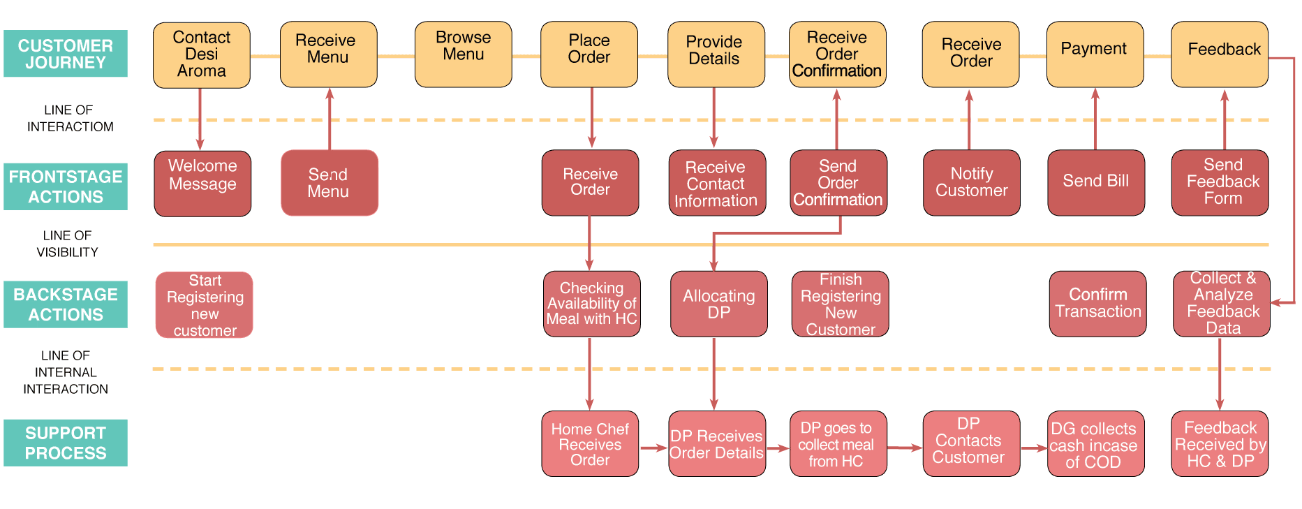
*Original artifacts shown as-is in 2018, not recreated. Please use the custom-built zoom feature to view the research text in detail.
Brand Building
From Service Concept to Brand Identity
Translating the service concept into a cohesive brand through identity, communication, packaging, and marketing touchpoints.
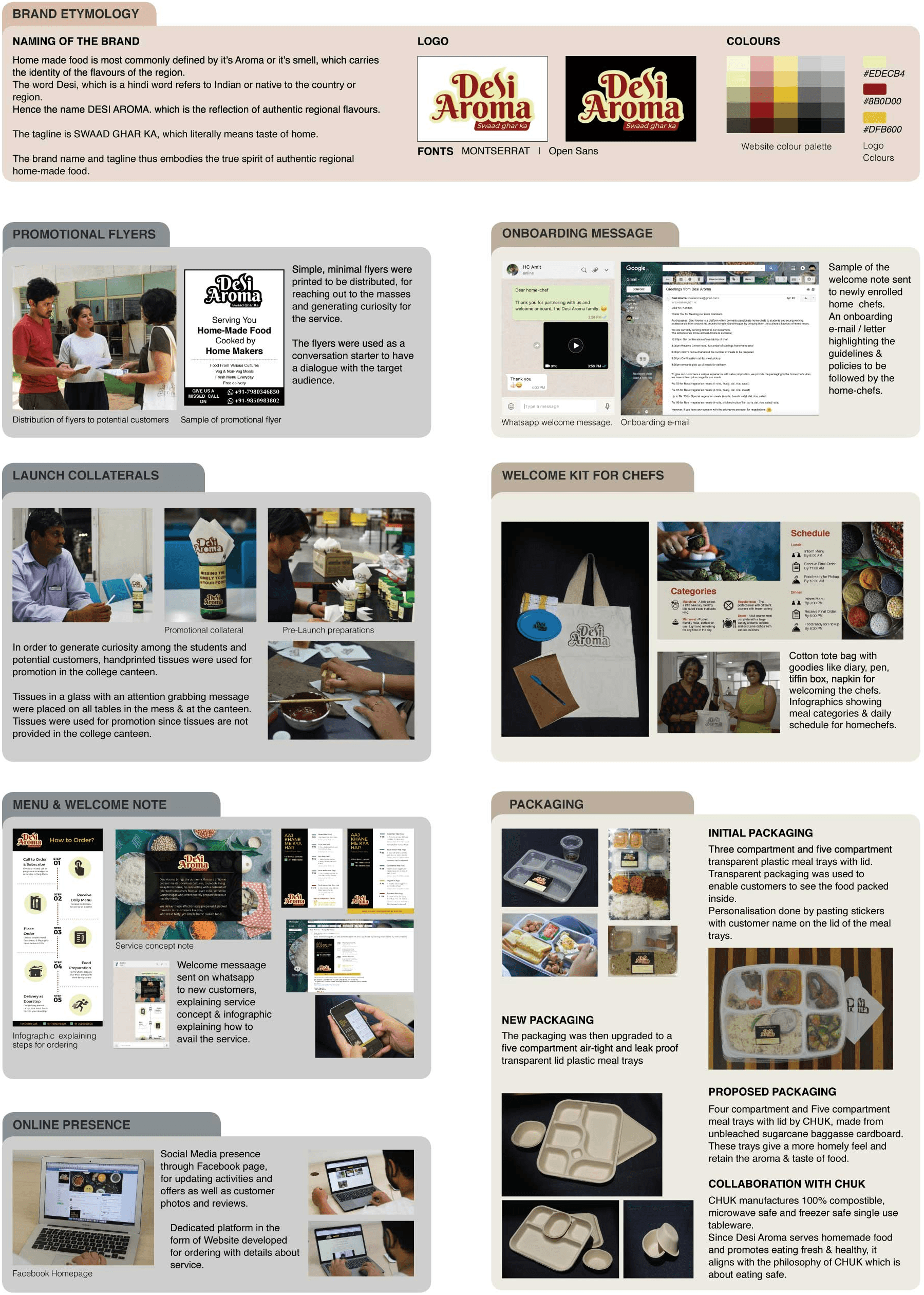
*Original artifacts shown as-is in 2018, not recreated. Please use the custom-built zoom feature to view the research text in detail.
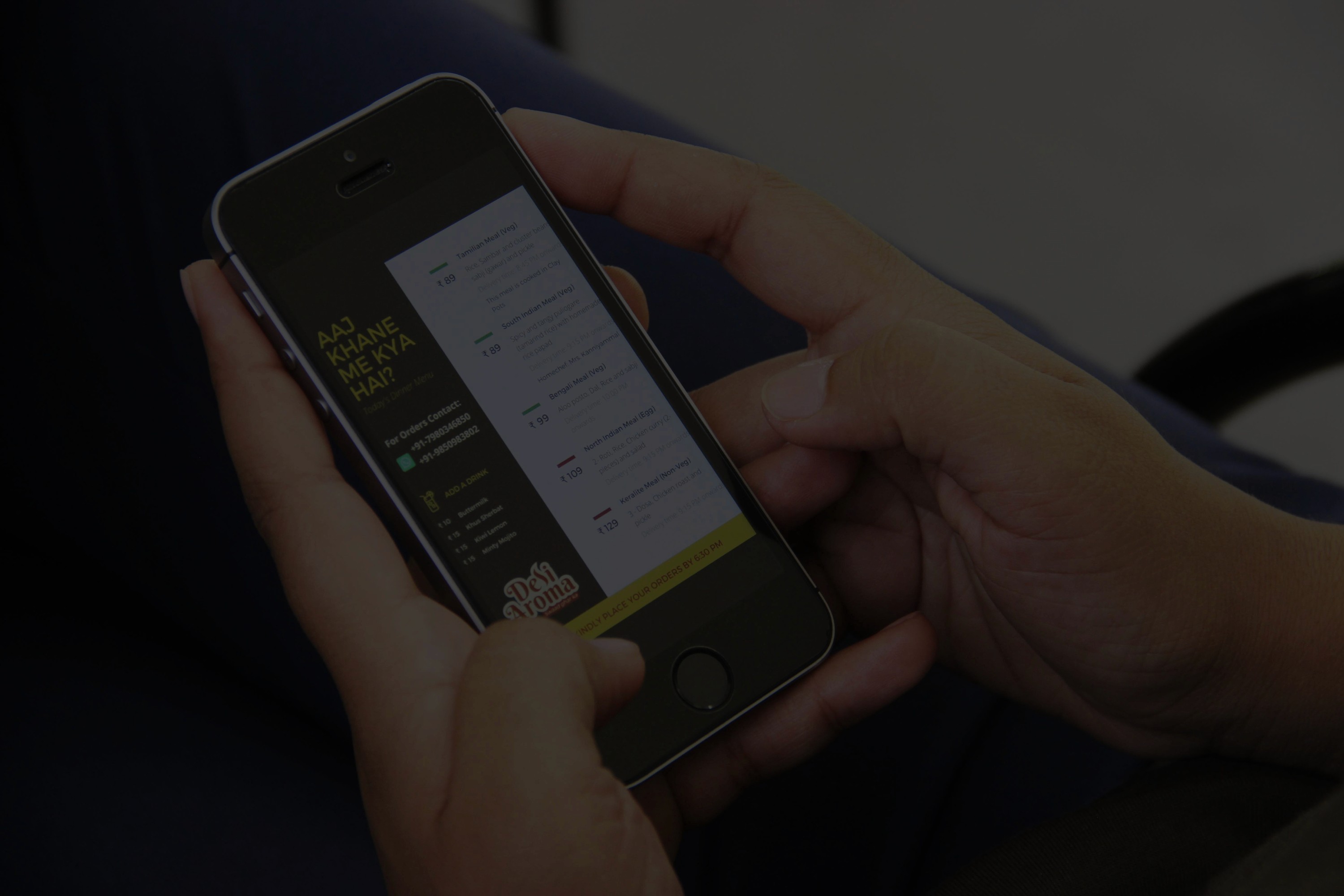
Concept Video
From Concept to Story
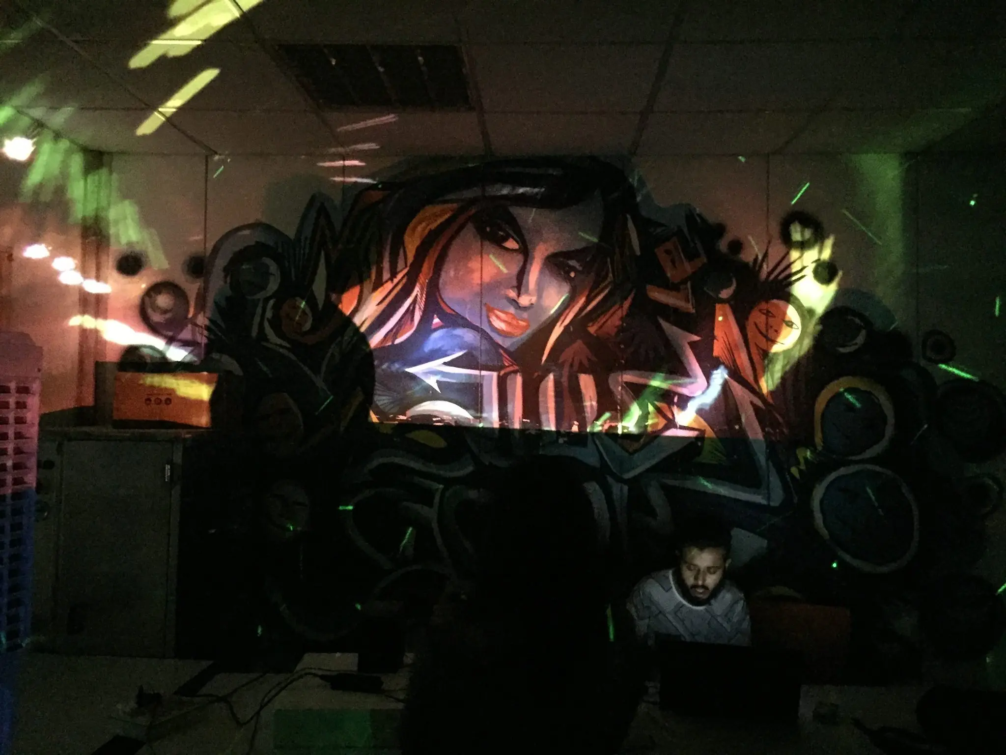
Bringing the service concept to life through a short video that communicates its value, vision, and experience to stakeholders.
Key Service Metrics
10
Service POC
Duration
6
Home
Chefs
135
Total
Orders
81
Total Customers
62%
Repeat Customers
Interface Design
From Service to Product
User Persona • User Flows • Wireframing • Design System • Prototyping • User Testing
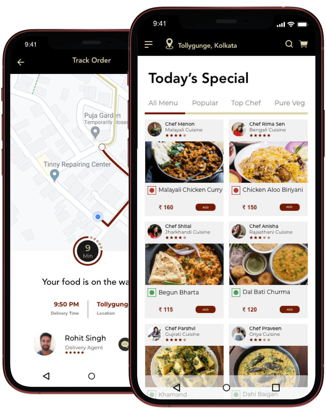
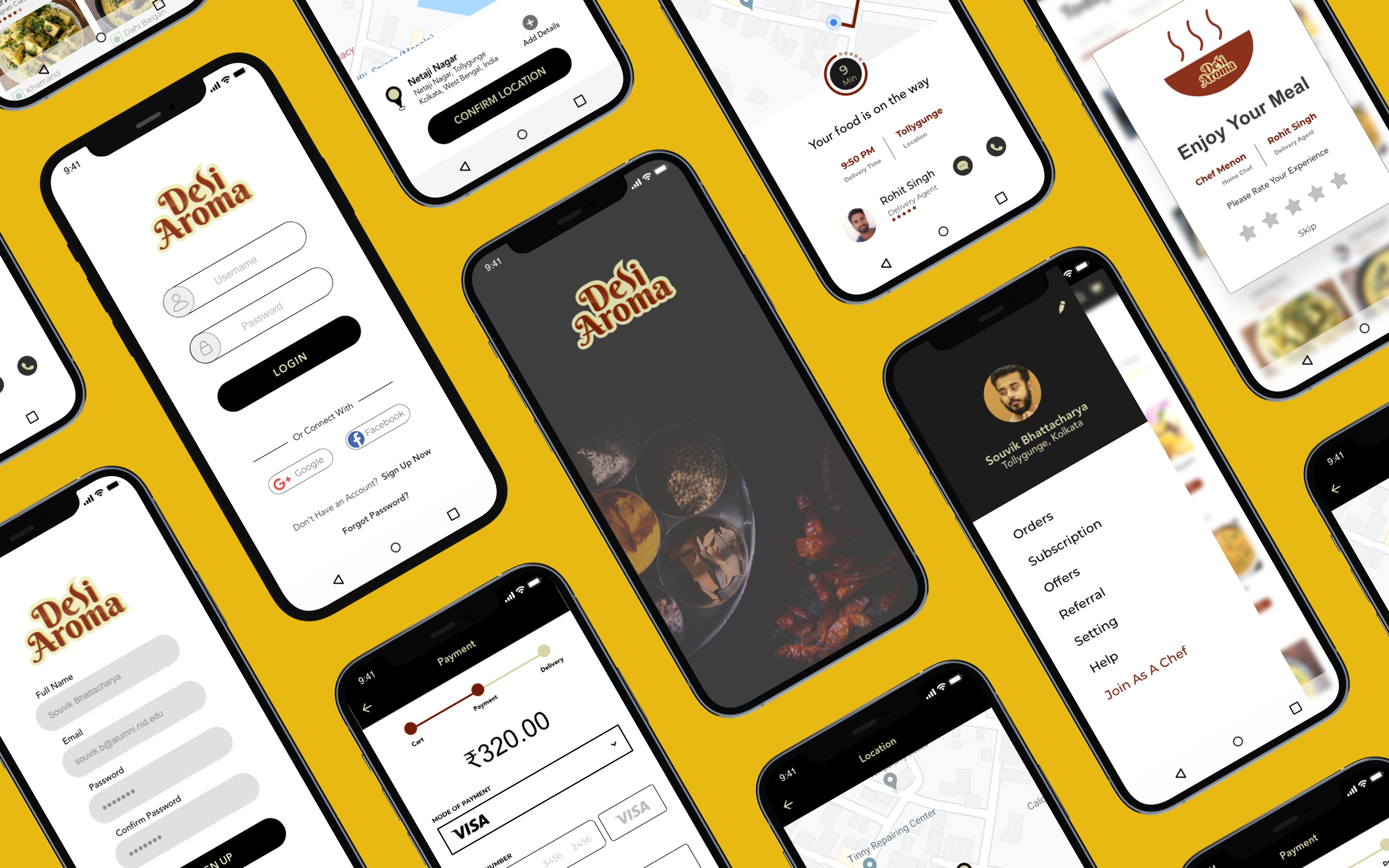
An app-based platform was envisioned as part of the scaling strategy, and a prototype was developed to demonstrate its functionality and potential.
Explore Other Client Projects
AI Powered
Builds
A collection of products I’ve built from idea to execution using modern AI tools. From identifying the problem and defining user journeys to designing the experience and shipping a functional product, these builds reflect my passion for turning ideas into reality.

Tracka
As a solo product designer, I built Tracka to solve a real problem faced by job seekers while expanding my role beyond UX. Alongside designing the experience, I defined the product logic, business rules, and technical architecture required to bring a functional application to life.
Client
Self-initiated product
Duration
3 months
Industry
Career Tech
Scope of Work
Full-stack Build
Information Architecture
Design System
Context
A Changing Job Market in the Age of AI
When I moved to Berlin and began my own job search, I noticed how diverse the job market was, with people from different cultural, educational, professional, and language backgrounds. At the same time, AI was changing how candidates were screened and evaluated, from AI-powered CV screening to AI-led interviews.

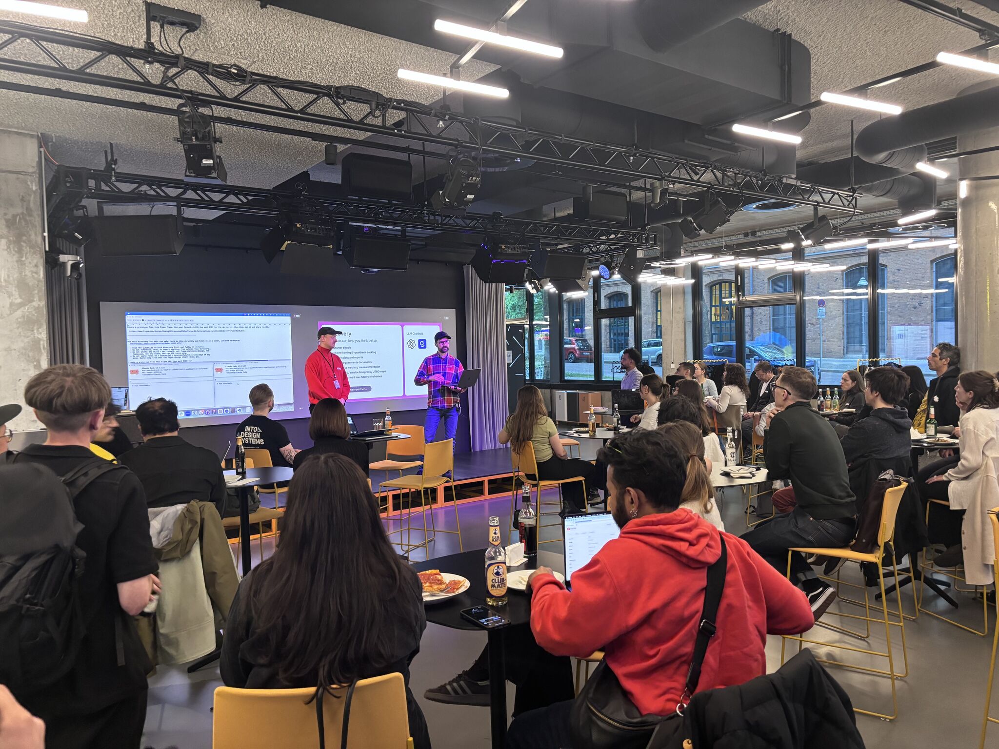
Me (blue and red printed T-shirt) in discussion with fellow job seekers and career mentors at a Berlin employment meetup, listening to diverse perspectives on navigating the German job market.
Problem
Job Searching Had Become a Process to Manage
Finding the right opportunity was only the beginning. Each application involved understanding the role, preparing and tailoring a CV, writing a cover letter, navigating AI-driven screening, and managing multiple applications, follow-ups, and recruiter conversations. Keeping track of everything became a job in itself.
Research
Understanding the Job Search Journey
Before exploring solutions, I wanted to understand how people actually manage their job search. I captured recurring behaviors, frustrations, and workarounds through informal conversations with job seekers and recruiters.
10+
Career Meetups
18+
User Interviews
7
Industries Represented
4
Hiring Managers
Analysis
From Insights to Product Decisions
Conversations with job seekers revealed four recurring themes. Rather than solving every problem directly, I focused on the areas where Tracka could create the greatest impact within its own experience.
01 · Personalized Applications
"I have to tweak my CV for every job, and in Germany the cover letter matters too. Sending the same one everywhere just doesn't work anymore"

Insight
Tailoring applications was the most time-consuming part of the job search. Users needed faster ways to personalize resumes and cover letters without compromising quality.
Feature
Resume & Cover Letter Builder
Analyze the job description
Extract ATS keywords
Generate personalized application materials
02 · ATS Optimization
"Everyone keeps talking about ATS these days... before I apply, I compare my CV with the job description using AI"

Insight
Candidates increasingly relied on ATS checkers and manually compared resumes with job descriptions to improve their chances of reaching recruiters. Identifying the right keywords had become an additional step in every application.
Feature
ATS Match Analyzer
Extract ATS keywords from the job description
Highlight missing skills and keywords
Estimate ATS match score
03 · Application Management
"By the time someone emails me back, the job posting has disappeared, I can't remember which CV I sent, where I saved the cover letter, or what the role was actually looking for."

Insight
As applications progressed, important information became scattered across job portals, emails, folders, spreadsheets, and documents. Reconstructing the full context of an application often took longer than expected, especially during interviews and follow-ups.
Feature
Unified Workspace
Save the original job description
Store tailored CVs and cover letters
Keep recruiter contacts and notes together
04 · Frictionless Onboarding
"I already uploaded my CV... why am I filling in my work experience, education, and address all over again? After a few applications, those long forms get really tiring."

Insight
While we couldn't eliminate repetitive forms across external job portals, we could remove the same friction from our own onboarding experience.
Feature
AI-Powered Onboarding
Upload an existing CV
Automatically extract profile details
Review and confirm before getting started
User Journey
Designing for Activation and Retention
The journey map captures how the experience evolves from a user's first interaction to repeated use. Comparing both journeys helped identify moments of uncertainty, opportunities to reduce friction, and design decisions that support long-term engagement.
Product Hierarchy
Defining the Information Hierarchy
Before moving into UI design, I defined the information architecture and key user entry points. The experience separates marketing, authentication, onboarding, and the core workspace into a clear navigation structure, creating an intuitive journey for both first-time and returning users.

Production Process
From Hand Sketch to Production UI
I started with hand-drawn sketches to explore the information hierarchy, content structure, and overall layout. Once the concept was clear, I recreated it as low-fidelity wireframes in Figma. These wireframes served as the design specification and context for AI Coding assistant to generate the initial high-fidelity interface, which I then refined through iterative design decisions.
Concept Sketch
Explore layout & information hierarchy

Figma Wireframe
Define structure & provide AI design context

Production UI
UI generated using AI coding agents, refined through iteration

Explore Other Client Projects
Design System
From Design System to Consistent Interfaces
A design system is only valuable if it can be applied consistently. I translated the system into structured documentation that AI could interpret, enabling reusable components, predictable layouts, and consistent outputs across the product.

Concept Exploration
Exploring Ways to Structure the Experience
Before committing to the final direction, I explored different ways of bringing the Tracker, Resume Builder, and Letter Builder together. I evaluated each concept against core UX considerations such as navigation clarity, cognitive load, scalability, and continuity across the job-search journey.
This helped me narrow the exploration to the direction that provided the clearest structure while keeping the three core workflows connected.
Selection Approach
Rather than choosing a direction based on visual preference, I used the product goals and user needs as evaluation criteria. The selected concept became the basis for the next stage, where I could validate the structure further through prototyping and usability testing.
Concept A

Concept B
Concept C
Technical Architecture
Building a Scalable Architecture
Rather than building custom infrastructure, I evaluated modern tools that could accelerate development while keeping costs low and maintenance minimal. The architecture prioritizes rapid iteration today, with the flexibility to replace individual services as the product scales.

Business Logic
Building a Consistent ATS Scoring System
The Problem - Tracka's ATS Analyzer scores how well a resume lines up with a job description before someone applies. Tracka initially used an LLM to calculate ATS scores. Because the model could interpret the same CV and job description differently across runs, the same application would receive different scores.
The Decision - I separated understanding from scoring. The LLM extracts structured job requirements once, while a deterministic ATS engine calculates the score using predefined matching logic and weighted dimensions. The result is consistent, transparent, and repeatable. The same input always produces the same score.
How It Works

Reflection
What I Learned While Building Tracka
Designing, building, and testing the product exposed challenges that only became visible during implementation. These experiences reshaped how I think about design systems, product logic, and product decisions.
01 · Layered Decision Making: Reliable products are built on clear fallback paths.
Building Tracka required defining product behavior for situations where a single rule wasn't enough. For example, deciding which theme the application should display meant evaluating multiple signals before reaching a final decision. This taught me to design layered decision paths that keep the experience predictable even when preferred inputs aren't available.

02 · Consistency & Reliability: Reliable products build more trust than clever features.
While designing the job tracker, I initially allowed users to add a job by pasting a job posting URL. Since different job boards use different page structures, universal URL extraction wasn't practical. Instead of forcing the feature to work everywhere, I redesigned the workflow so users paste the job description directly while the AI automatically extracts and fills the required fields. This reinforced that reliability creates more value than automation that only works in certain situations.

03 · Continuous Refinement: A design system evolves through continuous feedback.
While building Tracka with an AI coding assistant, I found that every new feature introduced new components, variants, and design refinements. Simply updating the design system in Figma wasn't enough because the AI also needed the latest design context to generate consistent interfaces. I learned to establish a feedback loop that kept both the design system and the AI aligned as the product evolved.

User Feedback
Build a tailored job application in under 15 minutes.
Tracka is live and continuously evolving through feedback from early users. I'm refining the experience with each iteration before making it available to everyone. Below are a few comments shared by people who have used it so far.
Creating things for people has always been what I enjoy most. That's what led me to design, and it's what continues to inspire my work today. I'm learning German as my fourth language while exploring how design, engineering, and AI can work together to make products that solve real world problems.
My Tech Stack
I work across design, AI, automation, and development, using the right tools to move from concept to prototype and working product.

Claude
My AI co-pilot for exploring ideas, prototyping, coding, and turning concepts into working products.

Figma
My core workspace for product design, prototyping, design systems, and exploring AI-assisted workflows.

n8n
My go-to for connecting APIs, automating workflows, and turning business rules into working product logic.

Github
Where I manage, version, and collaborate on the code behind the products I build.

Supabase
My backend layer for authentication, databases, storage, and quickly turning prototypes into functional products.

Vercel
My deployment layer for shipping, testing, and iterating on web products quickly.



Exploring the Edges of Product Design
I'm interested in what happens when designers move closer to technology, logic, and building. These are some of the areas I'm currently exploring through experiments and products.
01.
Business Rule Engines
Exploring how business rules, conditions, and decision logic can become part of the product experience, not just something hidden in the backend.

02.
Automating with n8n
Experimenting with automation, APIs, and open-source tools to connect workflows, remove repetitive work, and turn ideas into functioning systems.
03.
Exploring Local LLM Models
Exploring local LLMs, smaller models, and on-device AI as a path toward more private, controllable, and accessible product experiences.
04.
Switching Context with MCPs
Exploring local LLMs, smaller models, and on-device AI as a path toward more private, controllable, and accessible product experiences.
05.
Context Documents for AI
Exploring how Markdown files and structured documentation can give AI a consistent understanding of a product and produce consistent outputs.
