Portfolio
PAGANISM
I'm a title. Click here to add your own text and edit me.
I'm a title. Click here to add your own text and edit me.
PAGANISM
Client
Client
Medical Expo
Medical Expo
I'm a paragraph. Click here to add your own text and edit me. It’s easy. Just click “Edit Text” or double click me to add your own content and make changes to the font. I’m a great place for you to tell a story and let your users know a little more about you.
I'm a paragraph. Click here to add your own text and edit me. It’s easy. Just click “Edit Text” or double click me to add your own content and make changes to the font. I’m a great place for you to tell a story and let your users know a little more about you.
Client
Medical Expo
I'm a title. Click here to add your own text and edit me.
I'm a paragraph. Click here to add your own text and edit me. It’s easy. Just click “Edit Text” or double click me to add your own content and make changes to the font. I’m a great place for you to tell a story and let your users know a little more about you.

Insurance in the Digital Era
A digital Journey for Medical Insurance Professional
Portal-to-App
Feature Integration & UX Optimization
The client had a half-baked mobile app, missing key portal features, causing a clunky experience. We ran a UX audit to spot gaps and guide a clean, seamless redesign.
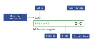
ADA & WCAG Compliance
Align the app with ADA and WCAG standards to ensure accessibility for all
Essential Feature Integration
Accurate representation and seamless integration of core portal functionality
Responsive & Consistent Design
Consistent branding across responsive mobile and tablet experiences
UX Audit
We conducted a thorough UX audit of UHC's legacy app based on NN Group's methodology, resulting in 5 key considerations.

Complex Navigation
Complicated navigation structures that hinders users their ability to find information quickly.

Unclear Call-to-Action
Unclear calls-to-action that may lead to user confusion regarding the next steps to take.

Inconsistent Design
Lack of design consistency across pages, which can create confusion.

Complex Form Structures
Lengthy screen content that may discourage users from completing important tasks.

Lack of Search Functionality
Lack of search feature and proper filter and sort options impacts the users ability to quickly find.

Proposed Information Architecture
To address navigation complexity, we simplified the information architecture based on UX audit insights. The revised IA improved clarity, discoverability, and enabled a more seamless and intuitive member experience.

Using IA and UX audit insights, we designed wireframes that simplify workflows, improve usability, and strengthen information clarity for agents.
Translating Insights
into Design


.png)

.png)
.png)


1.6x
Increase in Engagement
and Session Frequency
Improved ADA/WCAG compliance scores – Google Lighthouse
Higher portal/app logins and active users – Google Analytics
Increased mobile and cross-platform usage – Google Analytics