
Woolies AI · Meal Planner
Integrating generative AI into the Woolworths app — from “what’s for dinner?” to a ready cart
A concept for building generative AI into the Woolworths app. Shoppers describe a goal ("healthy meals for the weekend, $60") and get a meal plan and a shopping list they can edit, all tied to their local store's prices and specials.
Client
Woolworths (concept)
Duration
[Add duration]
Industry
Grocery Retail · AI
Scope of Work
AI Interaction Design
UX Research & Journeys
Design System
Overview
A native AI co-pilot for the weekly shop
The challenge — Woolworths wanted to show how generative AI could fit into its existing app, as a natural part of how people already plan and shop rather than a chatbot added on the side.
The approach — Start from a real job to be done, meal planning on a budget, and design an AI co-pilot that lives inside Lists. Every suggestion can be seen, edited and undone.
The outcome — An end-to-end clickable prototype (prompt → plan → list → edit → save → cart), a reusable Woolies AI design system, and AI design principles the team can apply to future AI features.
Client Need
Where AI actually helps shoppers
Woolworths’ Lists feature was a place to store products. It didn’t help people decide what to buy. The brief had three parts:
• Business — grow basket size and use of weekly specials, and bring people back to Lists more often.
• Product — test GenAI in a way that feels native to the app and safe for the brand.
• Customer — cut the effort of planning meals, sticking to a budget and working around diets.
Problem
Planning is the hard part, not buying
Shoppers plan meals across recipe sites, notes apps, paper lists and the grocery app. By the time they open Woolworths, the thinking is already done — somewhere else.
Busy shoppers struggle to turn meal intentions into a healthy, on-budget shopping list, because planning, pricing and product choice happen in separate places.
Research & Insights
How people really plan and shop
I audited the existing Lists flows, scanned competitors (Instacart, Ocado, Coles, HelloFresh and general AI assistants), mined app-store reviews and spoke with weekly grocery shoppers. General AI tools make good meal plans but can’t connect to real products or prices; grocery apps have the products but no help with planning. Four insights shaped the concept:
01
Meals come first, products second
“I think ‘tacos Tuesday’, not ‘500g mince’.” — Shopper interview [replace with real quote]
The app started at the product level, but people plan around meals. Woolies AI starts from a goal and builds meals first, then the list.
01
Meals come first, products second
“I think ‘tacos Tuesday’, not ‘500g mince’.” — Shopper interview [replace with real quote]
The app started at the product level, but people plan around meals. Woolies AI starts from a goal and builds meals first, then the list.

02
Budget is the real constraint
“I only find out I’ve overspent at checkout.” — Shopper interview [replace with real quote]
Most swaps are price-driven. Shoppers want a running total against their budget, not just per-item prices — so the budget bar is always visible.
02
Budget is the real constraint
“I only find out I’ve overspent at checkout.” — Shopper interview [replace with real quote]
Most swaps are price-driven. Shoppers want a running total against their budget, not just per-item prices — so the budget bar is always visible.

03
Diet filtering is manual work
“I check every single label for dairy.” — Shopper interview [replace with real quote]
People managing allergies or diets read every label themselves. Saved preferences and reason tags (‘Dairy-free’) take that load off.
03
Diet filtering is manual work
“I check every single label for dairy.” — Shopper interview [replace with real quote]
People managing allergies or diets read every label themselves. Saved preferences and reason tags (‘Dairy-free’) take that load off.

04
Trust depends on control
“If I can’t change it, I won’t use it.” — Shopper interview [replace with real quote]
AI suggestions only felt useful when anything could be removed, swapped or undone. Control became the core design principle.
04
Trust depends on control
“If I can’t change it, I won’t use it.” — Shopper interview [replace with real quote]
AI suggestions only felt useful when anything could be removed, swapped or undone. Control became the core design principle.

AI Principles
Principles we designed by
Before designing screens, I defined how Woolies AI should behave. Each principle maps to a specific moment in the product, and each solution below applies one or more of them.
01 · Human in control — every item can be removed, swapped or refined; nothing reaches the cart without confirmation.
02 · Explain the why — reason tags like “On special” and “Dairy-free”, plus a live budget bar.
03 · Set honest expectations — BETA label, “Woolies AI may not always get it right”, and example prompts.
04 · Personalise with consent — diet, allergies, household and budget are opt-in, editable and clearable.
05 · Fail gracefully — clear states for over budget, low stock, unclear requests and no results.
06 · Many ways in — type, speak, snap a photo of a list, or build it by hand.
07 · Learn from feedback — thumbs up/down, regenerate, and swaps that improve future suggestions.
01 · Finding where AI belongs in the app
A chatbot bolted onto the side would compete with Lists instead of helping it. I explored four entry points and tested which one people found and understood fastest.
Solution highlights
• Compared three create buttons, a floating action button, an inline AI widget, and a search bar with mic and camera
• Chose the inline AI widget on Lists: most discoverable, teaches through example prompts, and fits the existing IA
• Gave AI surfaces a subtle lime glow and BETA label so they read as helpful, not intrusive

02 · Mapping use cases and user journeys
To keep AI grounded in real needs, I mapped 15 use cases across planning, refining, saving, multimodal input and edge cases, then walked two proto-personas — Priya, a budget-juggling parent, and Josh, a health-focused professional — through end-to-end journeys.
Solution highlights
• Each use case names its trigger, what the AI does, how the user stays in control, and the principle it demonstrates
• Journey maps compare how people feel today versus with Woolies AI, stage by stage
• Every stage is tied to real screens and a success signal, like “time to first plan under 60 seconds”
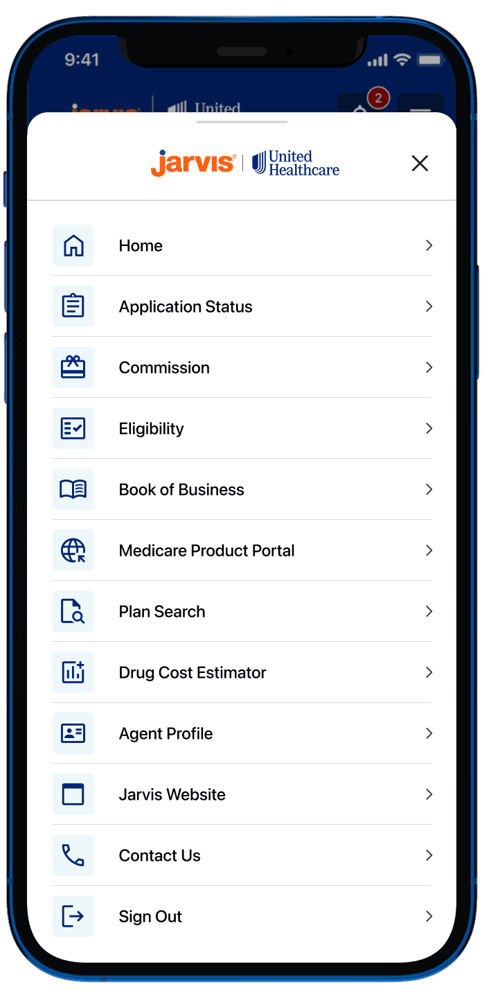
02 · Setting Navigation Hierarchy from Google Analytics Data
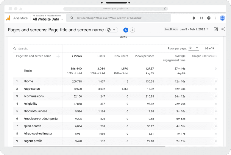
With the new structure in place, I still had to decide what agents saw first. Rather than guess, I pulled Google Analytics data on page views and engagement time and let actual usage set the order.
Solution Highlights
Pulled Google Analytics data on page views and engagement time across the app
Ranked features by actual usage, not internal opinion
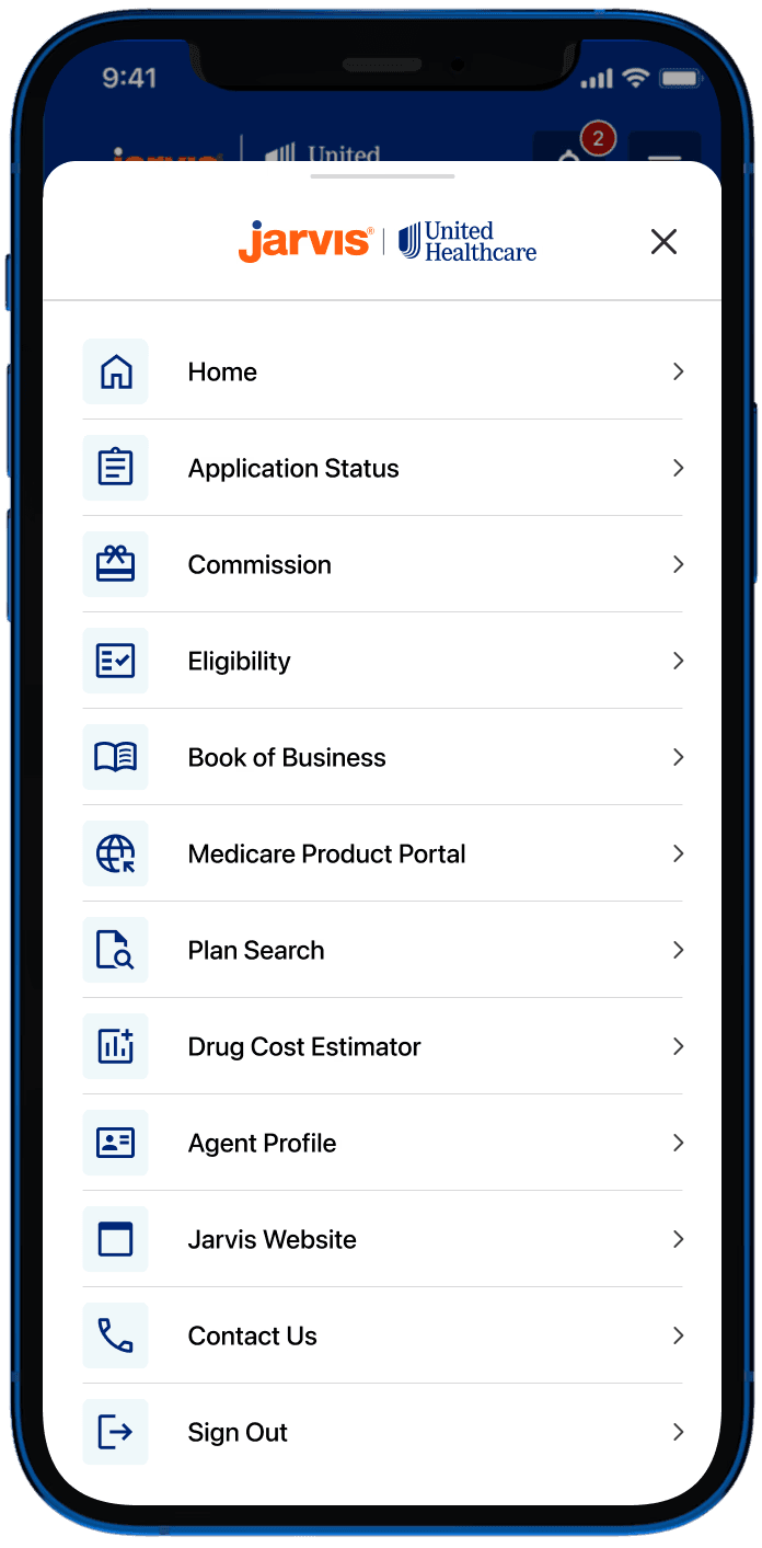
Placed the most-used features in the bottom navigation bar for one-tap access
Ordered the hamburger menu to match, most used to least

Priya’s journey map: what she does, thinks and feels at each stage today versus with Woolies AI, and the AI moment and principle behind each step.
The most visited pages identified in Google Analytics (left) were used to determine the hierarchy of items in the hamburger menu (right), aligning navigation with real user behavior.
The most visited pages identified in Google Analytics (left) were used to determine the hierarchy of items in the hamburger menu (right), aligning navigation with real user behavior.



03 · Building the Woolies AI design system
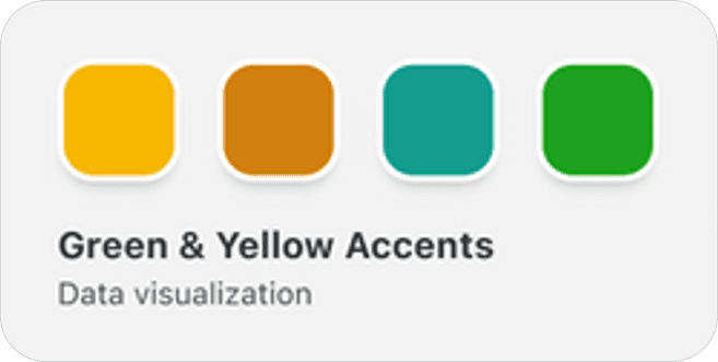
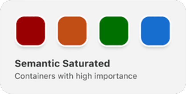
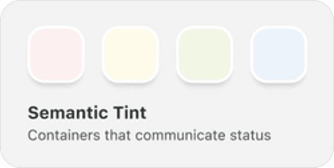
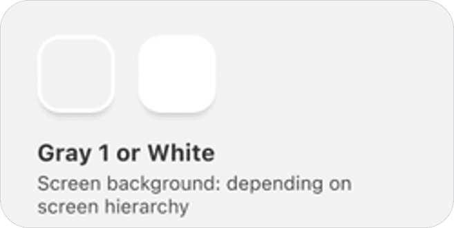
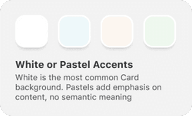
To keep 26 screens consistent, I extracted a design system from the Woolworths app — its greens, savings yellow and price patterns — and added an AI layer on top.
Solution highlights
• 73 variables (primitives, semantic colour, spacing, radius), 15 text styles and 3 effect styles, including an AI glow
• 30 components — buttons, chips, product rows, budget bar, prompt input, chat bubble, callouts — all bound to tokens
• A contrast audit caught brand green, placeholder grey and badge orange failing WCAG AA; fixed at the token level

04 · Wireframing the whole flow before pixels
I wireframed 26 screens across five flows in greyscale and wired them as a clickable prototype, so structure could be tested before visual design.
Solution highlights
• Landed on a hybrid: conversation to start, structured UI to decide
• Grouped the list by meal or by aisle, with the budget total always visible
• Designed edge states up front: unclear request, no results, over budget and low stock

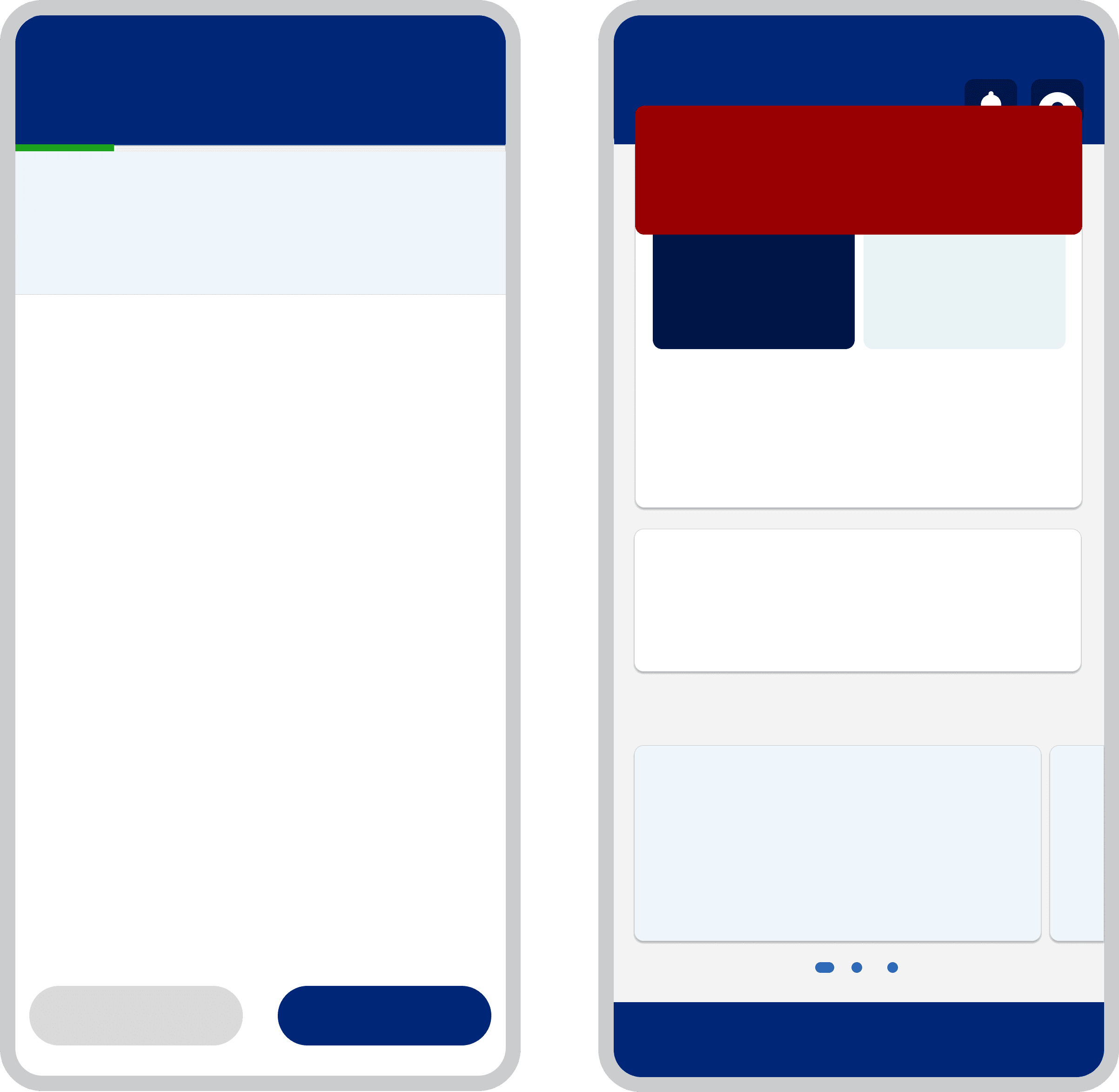
Low-fidelity wireframes of the core flow — prompt, generating, meal plan, smart list and swap — wired as a clickable prototype to test structure before visual design.

Wireframes were initially developed to align the team on the application's structure and user flow. These were then evolved into interactive prototypes that communicated transition states and user interactions, enabling consistent implementation by developers.
Wireframes were initially developed to align the team on the application's structure and user flow. These were then evolved into interactive prototypes that communicated transition states and user interactions, enabling consistent implementation by developers.
05 · High fidelity: keeping people in control
The hi-fi screens turn the principles into interactions. Woolies AI drafts; the shopper decides. Every suggestion explains itself and can be undone.
Solution highlights
• “Why this recipe” callouts with nutrition, and “Already have it” toggles for pantry items
• Conversational refine shows a before/after diff with the new total and a one-tap Undo
• Proactive over-budget swaps and low-stock alternatives, always ending in the shopper’s choice

Recipe “why this”, AI swaps, conversational refine with undo, proactive over-budget swaps and low-stock recovery — every AI suggestion stays visible, explainable and reversible.

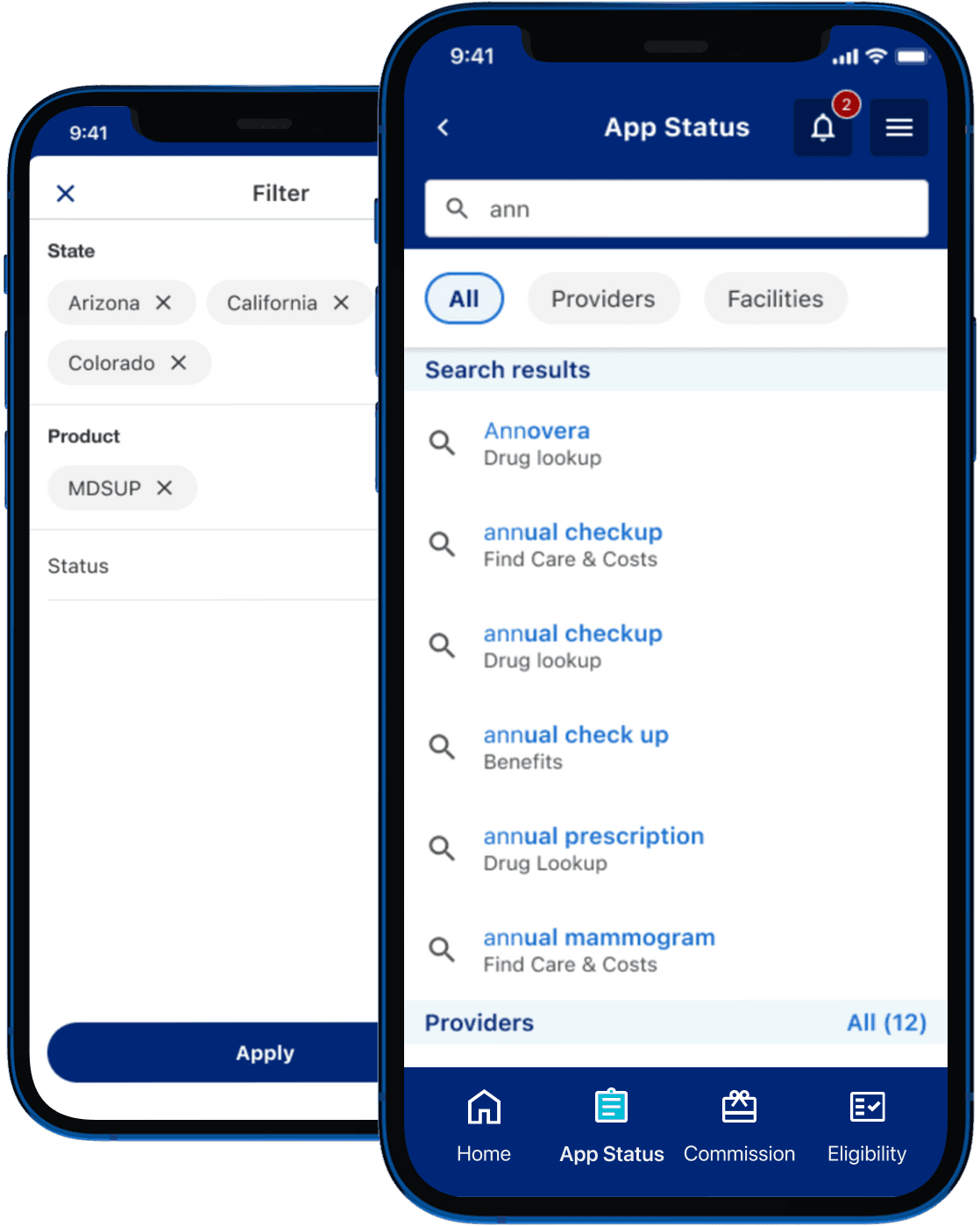
Stakeholder workshops for the Application Status page defined the search, filtering, and sorting experience, which was translated into the final UI shown on the right.
06 · Many ways in: photo and voice
Handwritten lists and quick voice notes are still common, so Woolies AI meets people where their list already is — on paper or in their head.
Solution highlights
• Snap a handwritten list: AI reads each line, matches products at your store and flags anything it couldn’t read
• Every match shows where it came from (“From ‘eggs’”) and can be changed before creating the list
• Voice adds items hands-free while cooking, applying saved preferences (e.g. oat milk for a dairy-free household)

Snap a list → AI reads and matches → review matches; and voice listening with a live transcript.
Outcome
What the concept delivered

End-to-end clickable prototype
26 connected screens across 5 flows — plan, refine, save and checkout, photo and voice, and edge cases — ready for stakeholder walkthroughs and usability testing.

Accessible, reusable design system
73 tokens, 15 text styles and 30 components grounded in the Woolworths app, with WCAG AA contrast fixes built into the brand tokens.

A shared language for AI features
7 AI design principles and 15 mapped use cases the team can reuse for future AI work. [Add a real outcome, e.g. stakeholder sign-off or test results.]
Impact
Measurable Business & User Impact
Reflection
What this project taught me
Designing for AI is less about the model and more about the moments around it. Three lessons I’ll carry into future AI work:
01 · AI isn’t the feature — the outcome is
Framing the work as “meal goal to ready cart” instead of “add a chatbot” made the value obvious to stakeholders and kept every design decision tied to a shopper’s real job to be done.
02 · Control builds trust
Being able to see why, swap, and undo mattered more than how clever the AI was. The moment suggestions became editable, people were willing to rely on them.
03 · A hybrid beats pure chat
Conversation is a great way to start, but structured UI is better for deciding — comparing prices, checking budgets and confirming a cart. The best experience blends both, and a design system keeps them consistent.

Explore Other Client Projects



Member Portal
As a Product Designer at an Indian consultancy, I worked on a 1.5-year project with a leading healthcare insurer. Starting with a UX audit, we rebuilt their incomplete mobile app from scratch with a new IA and new components in the design system.
Insurance in the Digital Era
Client
United Healthcare Group
Duration
18 months
Industry
Healthcare Insurance
Scope of work
App Design
Design System
Information Architecture
01 · Fixing the App's Information Architecture
Agents couldn't find things because the app was still running on the same information architecture as the web portal, a structure built for a desktop screen where everything is visible at once, not a phone. I rebuilt the IA from scratch based on real usage patterns.
Solution Highlights
Ran card sorting sessions to see how agents naturally grouped features
Reorganized 40+ screens into 5 task-based groups, cutting navigation depth by half
Validated the new structure with tree testing before wireframing
Reflection
What This Project Taught Me
Beyond improving accessibility and responsiveness, these are three lessons I'll carry into future projects.
01 · Design Decisions Need Evidence
Working on this project changed how I approach product decisions. During the redesign, different stakeholders had different views on which features should appear in the bottom navigation and the hamburger menu. Rather than relying on opinions, we used product analytics to understand which features users accessed most frequently and structured the navigation around actual behaviour. It reinforced that analytics isn't just a reporting tool, it's an essential input for UX decision-making.
02 · Platform Shapes Information Architecture
When I joined the project, the mobile experience was based on the same information architecture as the web portal. The same structure that worked well on desktop created unnecessary complexity on mobile. Designing around the mobile context resulted in a simpler navigation model and quicker access to frequently used features.
03 · Alignment Is Part of the Design Process
Adding search, filtering and sorting seemed straightforward until business expectations and technical constraints diverged. Running collaborative stakeholder workshops helped us prioritise features that delivered the most value while remaining technically feasible. It changed how I think about design. It's not just about creating interfaces, but also about aligning people around practical solutions.
05 · Introduced Search & Filtering to Improve Data Discovery
Finding the right claims data or check application took over 90 seconds, so agents gave up and switched back to desktop. There was no way to search or narrow down long lists.
Solution Highlights
Defined search and filter categories based on business workflows and stakeholder requirements.
Designed clear empty, loading, and no-results states for search experiences.
Defined filter chip behavior, multi-select patterns, and clear/reset interactions.
Stakeholder workshops for the Application Status page defined the search, filtering, and sorting experience, which was translated into the final UI shown on the right.
Challenge
Closing the Gap Between Portal and Mobile
The client's insurance agents work in the field, not at a desk, and had decided to make mobile their main channel. But the app was still missing features the legacy web portal had, so agents kept getting pulled back to desktop. Closing that gap is why I was brought on.
Users Leaving Mid-Task
Mobile drop-off ran well above what the portal saw for the same actions.Support Absorbing the Overflow
Over 15,000 calls a month came from members who got stuck on the app.Half the Portal Wasn't on Mobile Yet
Several web portal features hadn't made it into the app, so agents had to switch back to desktop to finish the task.

Discovery
UX Audit & Key Findings
Before touching any screens, I ran a UX audit against NN Group heuristics and cross-checked it with two quarters of analytics and support ticket data. Four patterns kept showing up, and each one was quietly costing the business money.
Unclear Call-to-Action
"I wasn't sure if tapping that would submit my claim or just save it."
— Insurance Agent
About 3 in 5 users hesitated or picked the wrong action on core screens during user interviews. Second-guessing what a button does slows every client interaction and erodes trust in the tool itself.

Lack of Search Functionality
"It takes me longer to find the record than to actually do the work." — Support Staff
Finding the right plan took over 90 seconds on average. Instead of finishing on their phone, members gave up and switched to desktop.

Complex Navigation
"I know this feature exists somewhere, I just never know which menu it's hiding in." — Product Analyst
Users took 4 to 6 taps to reach screens that should've taken 2. Every extra tap meant more people abandoning the task, and abandoned tasks were flowing straight into support call volume.
Unclear Call-to-Action
"I wasn't sure if tapping that would submit my claim or just save it."
— Insurance Agent
About 3 in 5 users hesitated or picked the wrong action on core screens during user interviews. Second-guessing what a button does slows every client interaction and erodes trust in the tool itself.

Complex Form Structures
"On mobile I have to scroll left and right just to fill out one form. I'd rather just do it on desktop where I can see the whole thing at once." — Insurance Agent
Claims and enrollment forms had the highest drop-off in the app, around 40%. Biggest single driver of support calls.
Solution
Solutions Mapped to the Audit Findings
Each fix below responds directly to a finding from the audit. The goal wasn't a redesign for its own sake, it was to solve the specific problems agents were already running into every day.