Portfolio
PAGANISM
I'm a title. Click here to add your own text and edit me.
I'm a title. Click here to add your own text and edit me.
PAGANISM
Client
Client
Medical Expo
Medical Expo
I'm a paragraph. Click here to add your own text and edit me. It’s easy. Just click “Edit Text” or double click me to add your own content and make changes to the font. I’m a great place for you to tell a story and let your users know a little more about you.
I'm a paragraph. Click here to add your own text and edit me. It’s easy. Just click “Edit Text” or double click me to add your own content and make changes to the font. I’m a great place for you to tell a story and let your users know a little more about you.
Client
Medical Expo
I'm a title. Click here to add your own text and edit me.
I'm a paragraph. Click here to add your own text and edit me. It’s easy. Just click “Edit Text” or double click me to add your own content and make changes to the font. I’m a great place for you to tell a story and let your users know a little more about you.


Crafting an Inclusive
Digital Experience
Revamping a medical product for the US market to ensure ADA compliance and drive wider adoption.

Project Objectives
To revamp the Medicare Prepaid Payment Plan Portal in accordance with WCAG guidelines and conduct UAT with visually challenged users
01
Usability Enhancement for Senior Citizens
Simplify navigation and improve access to key features to create an intuitive, senior-friendly platform.
02
Ensuring ADA Compliance for All Users
ADA compliance with comprehensive accessibility support, including screen readers and keyboard navigation.
03
UI Modernization and Responsiveness
Ensure accessibility and a seamless experience across devices of all sizes.
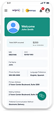
Manage Prescription Cost
Intuitive Navigation Screen Reader Compatibility with Mobile Devices Process Guidanceage
High Contrast Text Mode Access Information Voice Assistance Feature Adjustable Text Size


UX Enhancements
We conducted a comprehensive UX audit of the legacy app using NN Group's methodology and presented our findings and proposed solutions to the stakeholders.
/01
Refining Visual Hierarchy according to Gutenberg Diagram
Weak visual hierarchy reduced content clarity and CTA effectiveness.
Applied Gutenberg’s principles to create a clear visual flow and strategically place CTAs for higher engagement.
Gutenberg Diagram


Old Landing Page

New Landing Page


Smartphone
320px–480px
Tablet
481px–1025px
Desktop
1025px +
/02
Implementing Responsive Design with Breakpoints
Created responsive Figma prototypes using defined breakpoints for mobile, tablet, and desktop.
Leveraged auto-layout and constraints to dynamically adapt touch targets, text, and imagery—ensuring a seamless experience across all device sizes.
/03
Streamlining Information Hierarchy for Better Usability
Poor information hierarchy created visual clutter and hindered navigation.
Reorganized content with clear headings, logical grouping, and visual cues to improve readability and user flow.

Old Card Design
New Card Design

Old Design: The FAQ page was cluttered, with questions poorly categorized, making it difficult for users to find relevant information.
New Design: The FAQ page follows an industry-standard layout with clear categories and a help section for improved navigation.

Filter and Sort Options
/04
Improving Data Retrieval Efficiency for Better User Experience
Lack of search functionality and complex tables slowed data retrieval.
Defined key filters through stakeholder workshops and implemented autocomplete search, filtering, sorting, and a simplified, consistently styled table to speed and clarify data access.

Restructuring of Information Architecture
The mobile IA and navigation were restructured to prioritize key actions
Elevating Accessibility
User interviews with individuals facing accessibility challenges, particularly visual impairment, provided valuable insights. Based on their feedback, we improved color contrast, standardized button designs, and optimized screen reader compatibility to create a more accessible and inclusive application.
/01
Standardizing Button Design
We implemented a standardized design system with clear sizes, colors, and placements to define button roles and priorities. Large touch targets and consistent screen reader labeling were added to enhance interaction and accessibility.
-
High-Contrast Colors: Ensured sufficient contrast between buttons and backgrounds according to WCAG guidelines.
-
Accessible Focus States: Added visible focus indicators to assist keyboard and screen reader users in navigation.
-
Large Touch Targets: Designed buttons with ample size for easy interaction on touchscreens.
-
Consistent Labeling: Provided clear and consistent labels to help screen readers identify button functions.

Old Design: A flat button layout with no hierarchy or defined button states.

New Design: Implemented a clear button hierarchy with distinct states.
/02
Enhancing UI Readability with Accessible Colors
The lack of an accessible color palette with insufficient contrast between text and backgrounds made it challenging for users with visual impairments to navigate the UI. To address this, we implemented a standardized design system by adhering to WCAG guidelines to achieve AAA compliance, ensuring optimal readability for all users.
Key improvements included:
-
WCAG AAA Compliance: Achieved a 4.5:1 contrast ratio for standard text and a 7:1 ratio for large text.
-
Support for High-Contrast Screens: Ensured compatibility with high-contrast screen settings for visually challenged users.


Old Design: The colors used failed WCAG contrast tests, with a ratio of 2.06:1, falling below the permissible ratio.


New Design: Adjusted color palette to meet WCAG guidelines, ensuring a contrast ratio of at least 4.5:1.
/03
Interactive and Responsive Input Fields
The original input fields lacked visual focus indicators, error messages, and placeholders, making navigation and error correction difficult, particularly for screen reader users. We revamped the input field designs to improve usability and accessibility.
Key updates include:
-
Enhanced Focus Visibility: Implemented visual focus indicators like border changes and background color shifts for better navigation.
-
Integrated Clear Error Messages: Added specific, actionable error messages linked to input fields to guide users in correcting mistakes.
-
Descriptive Placeholders: Included informative placeholders to clarify required information and support screen readers.

Old Design: The layout didn’t adhere to mobile design standards, lacked screen reader support, input field states, and error messages.

New Design: Added screen reader labels, defined input states, and included error messages for better usability.
Project Highlights
Throughout the course of this 7-month project, led by me with two other designers, several key improvements were made to enhance accessibility and user experience. The following highlights showcase the major achievements and outcomes:
Comprehensive UX
Auditing
What started as a UX audit project expanded into a full-fledged revamp of multiple products, thanks to positive feedback and praise from stakeholders.
Design System & Feature Integration
Developed a new design system from scratch, which will serve as a valuable asset for future UI changes and feature integration.
User Testing & Feedback
Conducted comprehensive testing with the accessibility team, incorporating feedback from users with accessibility needs to drive impactful improvements.