Portfolio
PAGANISM
I'm a title. Click here to add your own text and edit me.
I'm a title. Click here to add your own text and edit me.
PAGANISM
Client
Client
Medical Expo
Medical Expo
I'm a paragraph. Click here to add your own text and edit me. It’s easy. Just click “Edit Text” or double click me to add your own content and make changes to the font. I’m a great place for you to tell a story and let your users know a little more about you.
I'm a paragraph. Click here to add your own text and edit me. It’s easy. Just click “Edit Text” or double click me to add your own content and make changes to the font. I’m a great place for you to tell a story and let your users know a little more about you.
Client
Medical Expo
I'm a title. Click here to add your own text and edit me.
I'm a paragraph. Click here to add your own text and edit me. It’s easy. Just click “Edit Text” or double click me to add your own content and make changes to the font. I’m a great place for you to tell a story and let your users know a little more about you.
Crafting an Inclusive
Digital Experience
Revamping a medical product for the US market to ensure ADA compliance and drive wider adoption.

4,187 lawsuits for digital accessibility were filed in the USA by the end of 2024.
Source: UsableNet
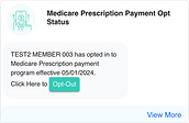
My client, who offers a Medicare product suite for the U.S. market, was facing challenges because their offerings were not ADA-compliant. As the UX Lead on this project, I led the redesign of their flagship medical product and conducted UAT with real users of assistive technologies who have visual disabilities.
My Approach to
Inclusive Design
Started with a UX audit to uncover critical UI and accessibility issues, setting the foundation for a full product revamp. As the scope grew, I scaled the team to three designers and led the end-to-end redesign.

UX Audit & Usability Review
Audited the legacy app using NN/g principles. Identified key issues and defined actionable improvements.

Strategic Stakeholder Alignment
Aligned stakeholders on priorities, shifting the scope from incremental fixes to a full redesign.

Accessible Design
System
Created an accessibility-first design system for consistent, scalable, cross-device experiences.

User Acceptance
Testing
Tested with assistive technology users to validate accessibility in real-world use.
What I Learned from Designing with Users with Visual Disabilities
“I use a screen reader to navigate screens, and placeholder text helps it clearly announce what each field is for.”
Suresh Nandu,
Senior Test Engineer
“With my low vision, when I zoom in up to 400–500%, everything starts to look similar, and without underlines, I can’t clearly tell which text is a link.”
Sreeraj K,
Test Engineer
“With my low vision, I can tell something is wrong, but I need the color change and error message to clearly see which field needs correction.”
Rakhi Menon,
Test Engineer
/01
Choosing the Right Colour
Through direct interactions with users who rely on high-contrast screens, I gained invaluable insight into their perspective. This guided us to select color combinations that work seamlessly with these screens, dramatically improving clarity and usability.
Accessibility Testing Tool: Adobe Colour Contrast Analyzer
Before

After

The above Contrast Analyzer UI elements were custom-built using Claude Code to showcase interactive design work. They are fully functional, feel free to test color combinations and check contrast using the sliders and color pickers.
Old Landing Page
New Landing Page


/02
Optimizing UI for
Assistive Tech
We established descriptive placeholders, persistent labels, and clear error/success indicators. ARIA labels were defined for all interactive elements, ensuring screen reader clarity.
These enhancements were embedded into the design system, making accessibility the default standard.
The HTML-embedded interaction was built using Claude Code to showcase real-time user input behaviors. It highlights how the fields react during interaction, and the ARIA labels provided ensure accessibility in each state.
/03
Refining Visual Hierarchy according to Gutenberg Diagram
Applied Gutenberg’s principles to create a clear visual flow and strategically place CTAs for higher engagement.
Before

After


Old Landing Page
New Landing Page


/04
Implementing Responsive Design with Breakpoints
Created responsive Figma prototypes using defined breakpoints for mobile, tablet, and desktop. Leveraged auto-layout and constraints to dynamically adapt touch targets, text, and imagery—ensuring a seamless experience across all device sizes.
320px – 480px
Smartphone
481px – 1025px
Tablet
1025px +
Desktop
Old Landing Page
New Landing Page


2.2× improvement in contrast ratio
Screen reader compatible UI components
Designed to support high contrast mode
Fully accessible through keyboard navigation

As the world moves toward AI search, AI systems struggle with inaccessible websites. By making sites accessible, we empower all users and AI, ensuring a richer, more discoverable web for all.
Source: webaim.org

Phase 2
Associate Portal Redesign
The success of the initial redesign led to revamping the client’s associate portal, bringing the same accessibility standards to another key product.